Fall is in full swing, and October’s Color Story from Fusion Mineral Paint combines the perfect colours for this time of year! The weather here in Canada has cooled down and we are admiring the beautiful, rich colours of the season. Thanks to the cold, the leaves have turned and sweater weather is here! That means it’s the perfect time to bundle up and enjoy the brisk weather, or cozy up in your favourite wool socks with a cup of coffee or tea (or a Pumpkin Spice Latte – we love them too!) October brings exciting events like Canadian Thanksgiving and Halloween. So go ahead and gather your friends and family to celebrate and prepare for winter! But don’t forget the tasty treats!
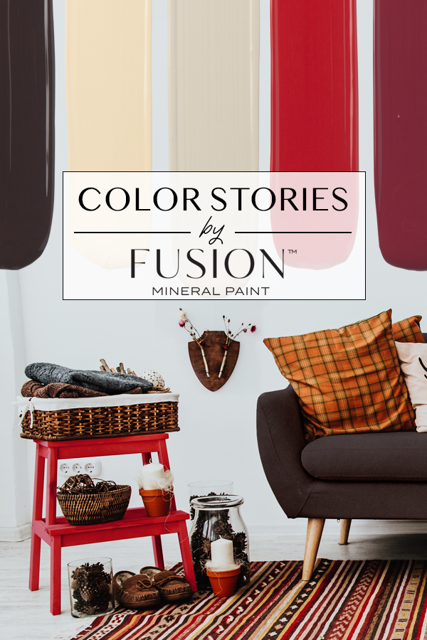
October’s Color Story is our richest palette yet, as it features some of our deepest hues with light, warm accents. This bold pallet is inspired by the season, the leaves, the chocolate, and all the fun that occurs in October.
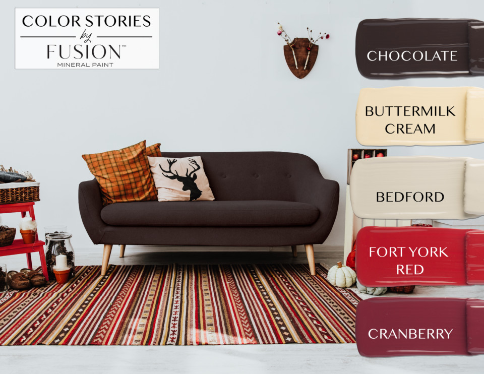
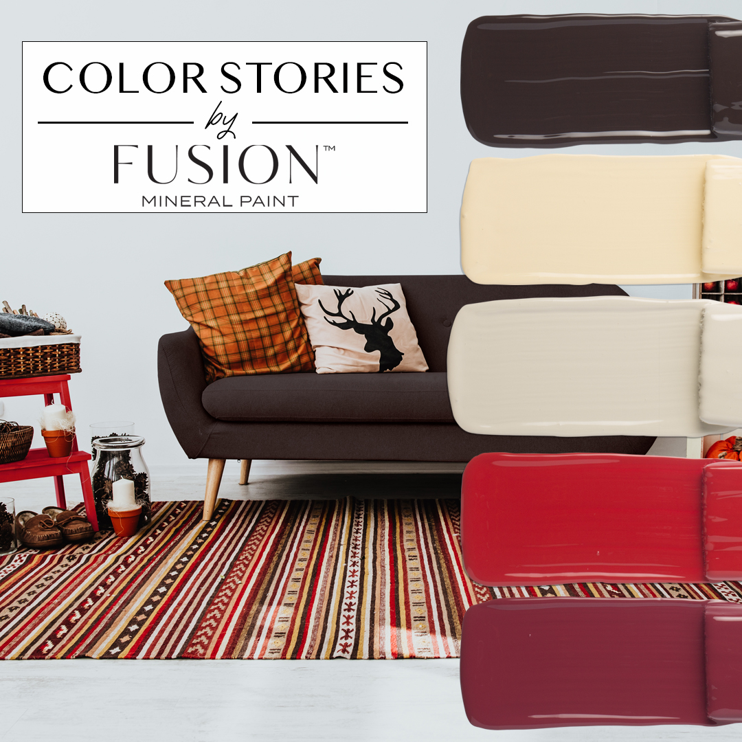
If you’re looking to decorate your own home in October’s Color Story, try to choose more neutral colours for your larger pieces of furniture. Just in case you decide to change out the accent colours later on! This warm palette is definitely meant to induce a cozy feeling – great for a basement or den. And did you notice that this couch is the perfect tone to match Fusion Mineral Paint’s Chocolate?
Also, note the stool – that’s totally Fort York Red! And don’t forget Bedford – check out that cute painted pumpkin! (For more info on painting your own pumpkins with Fusion, check out this blog post.) Finally, the patterned rug perfectly ties in all the colours in October’s Color Story – the grounding neutral Chocolate; the soft neutrals Bedford and Buttermilk Cream; and the Fort York Red and Cranberry accents. As you can see, a rug is a great way to quickly change your decor between seasons and introduce new colours, without having to change out your staple pieces!
Let’s cozy up to the gorgeous colours in October’s Color Story!
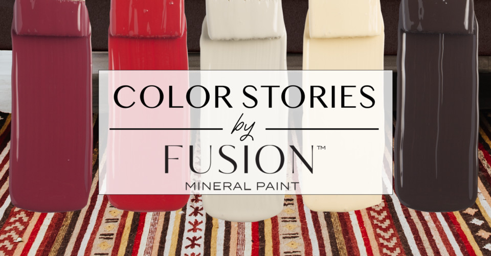
This rich brown is perfect for undercoating when you want to achieve a distressed look, as it can take on a very natural wood look. Chocolate is a deep and delicious colour, named for the thoughts of chocolate and coffee that it evokes. Add Chocolate to a neutral palette for warmth, or to a cool palette for a natural element. It goes great with just about any of the other Fusion Mineral Paint colours, but try pairing it with some Elderberry for a surprisingly beautiful finish!
Just as the name indicates, this is a soft, creamy yellow. Buttermilk Cream goes well with greens, grays, reds, or black for a traditional feel. Pair it with something bold – think Renfrew Blue! – for a modern and punchy look.
One of our hidden gems, this is a mid-range neutral grey with a soft undertone of yellow. For a bold pairing, use Bedford with any bright colour. It also works well with other neutrals for a natural feel – and can even be used in layered dry brushing for a driftwood effect.
Named after a Toronto landmark, this bright, true red is also associated with passion & love. As such, it has been extremely popular over the years. Its colour adds a feeling of excitement in a neutral room or a stimulating accent. This is definitely a bold accent colour!
A true statement colour. Cranberry is a burgundy red that mimics cranberries in a way that is both bold and cozy. Paired with Chocolate, Cranberry can take on a very masculine feel. Pair it with something lighter to make Cranberry the centrepiece. Bring in some pinks, and you’ve got a beautiful, feminine red.
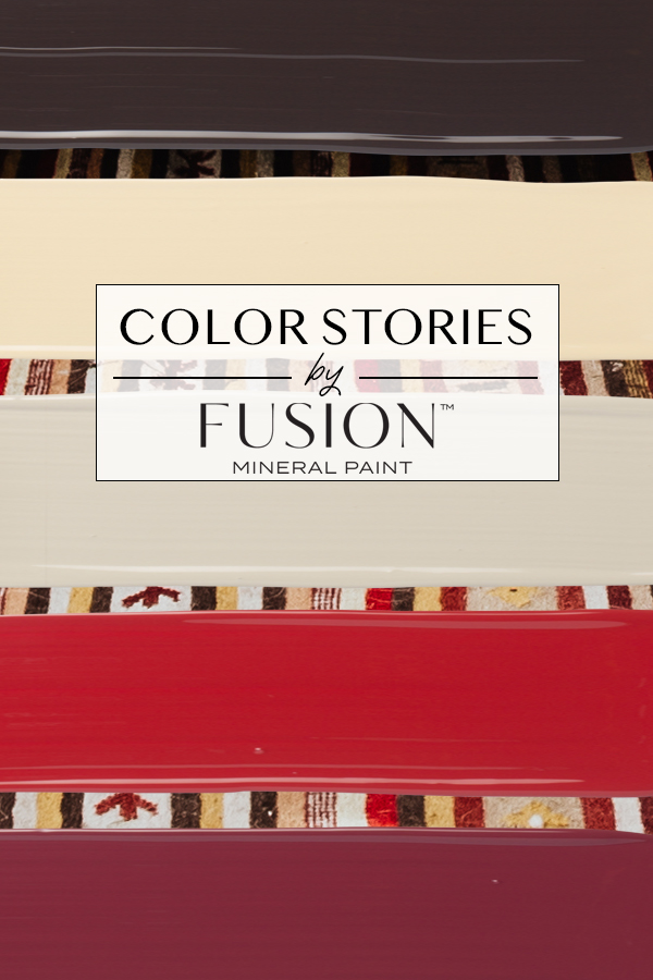
What colour inspires you most from October’s Color Story? What other Fusion Mineral Paint colours remind you of fall? If you’ve created any projects using these colours, please tag us on social media, use #PaintitBeautiful, and join our Facebook Group!


One Response