

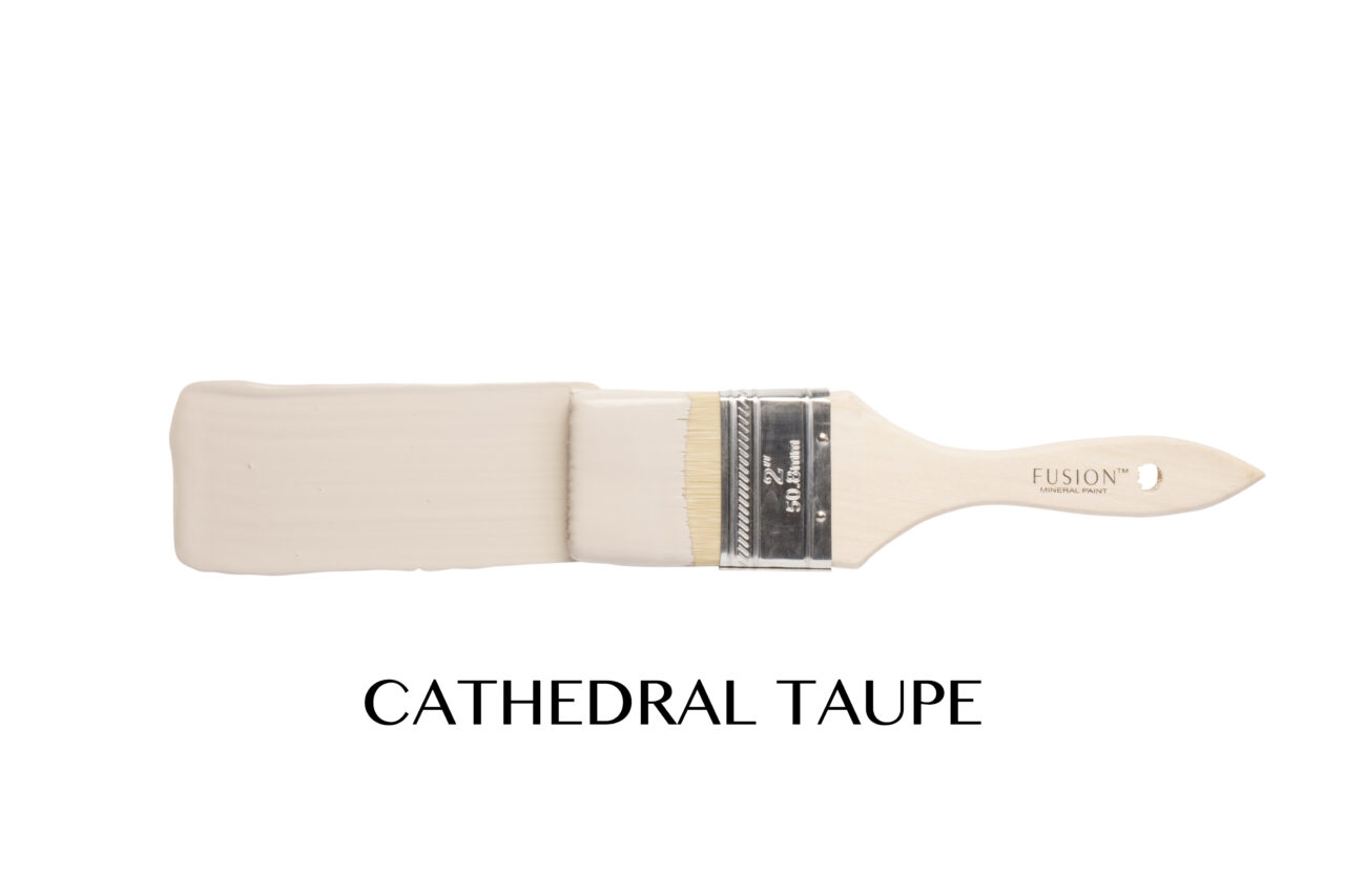
Some colours whisper. Some colours shout. Cathedral Taupe does something far more clever… it adapts.
This beautifully balanced neutral sits right between warm and cool, making it one of the most versatile shades in the Fusion™ Mineral Paint collection. It’s a soft, warm beige neutral with subtle pink undertones, giving it a grounded, calming presence without feeling flat or dull. It pairs effortlessly with natural wood, crisp whites, deep charcoals, and even layered textures like stone.
And just look at how it transforms across completely different pieces:
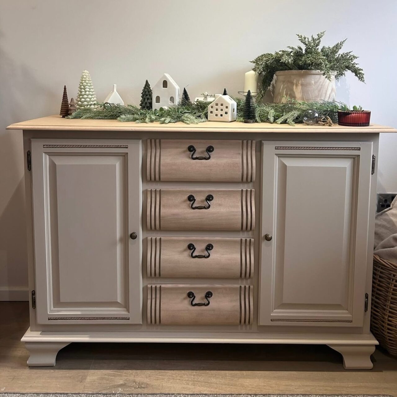
Natalie Wilkins used Cathedral Taupe on her buffet, washing the drawers for added depth and dimension.
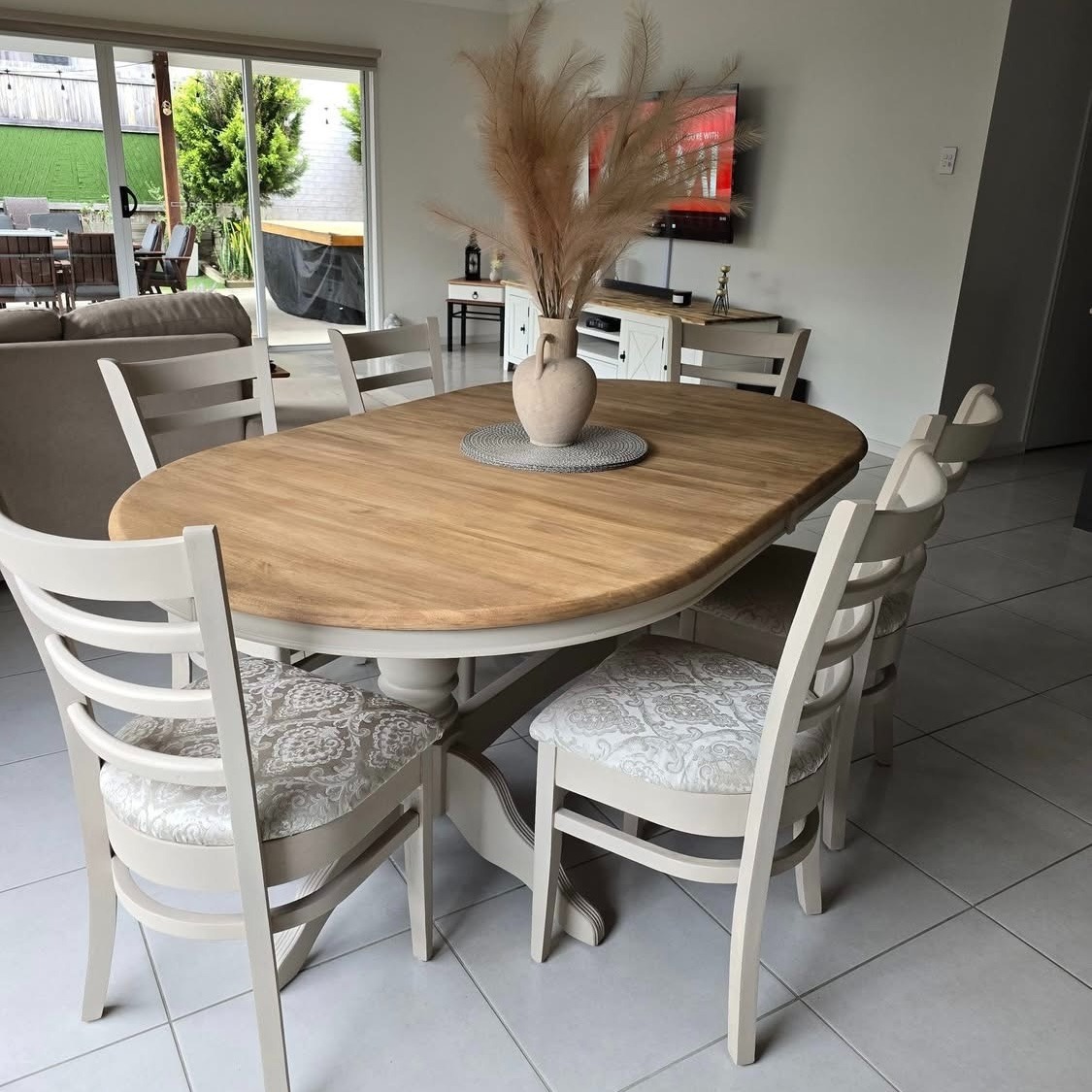
Sophie Latter refreshed a table and chairs set, creating a cohesive look that’s both modern and welcoming.
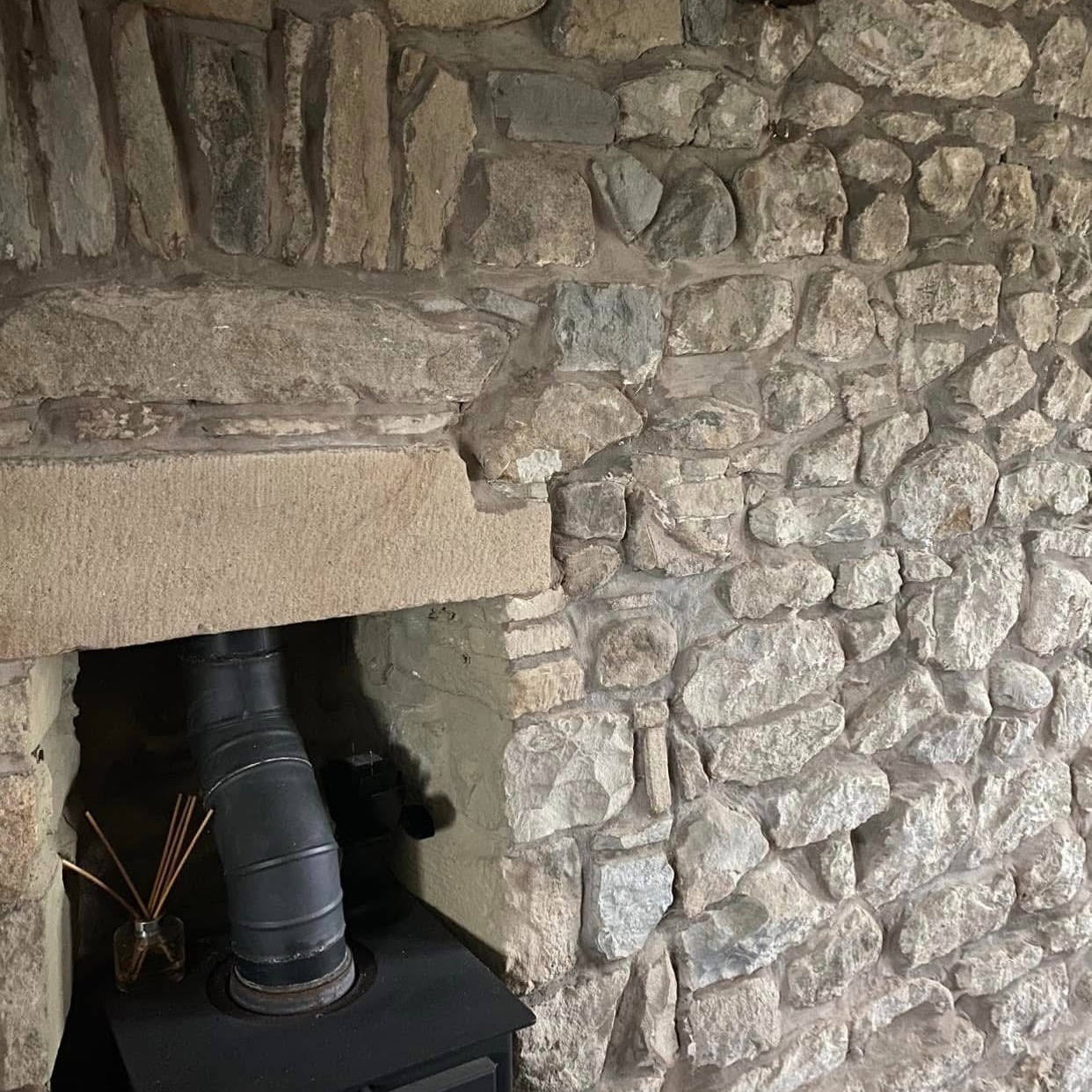
Tina Bennett took versatility even further by painting the grout on her natural stone fireplace, softening and unifying the entire feature wall.
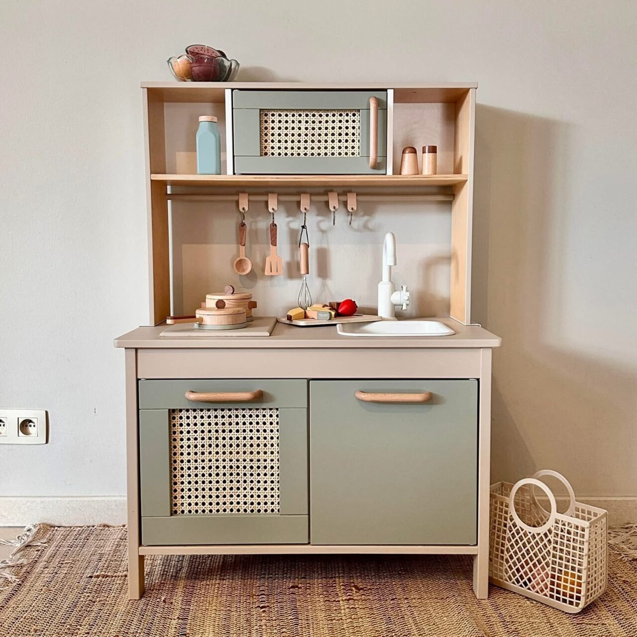
Eva Deprez brought it into a playful space on a toy kitchen, showing that neutrals can be just as impactful in children’s pieces.
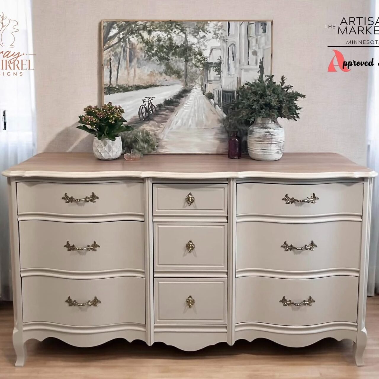
Kaelyn Evans showcased its elegance on a dresser, proving how refined and timeless this shade can feel
From statement furniture to subtle architectural details, Cathedral Taupe moves seamlessly between traditional and contemporary spaces. It adds warmth without overpowering, depth without heaviness, and sophistication without trying too hard. Share your work with us and be sure to tag us @fusionmineralpaint on Facebook and Instagram.
If you’re looking for a colour that truly works anywhere, this might just be it.