
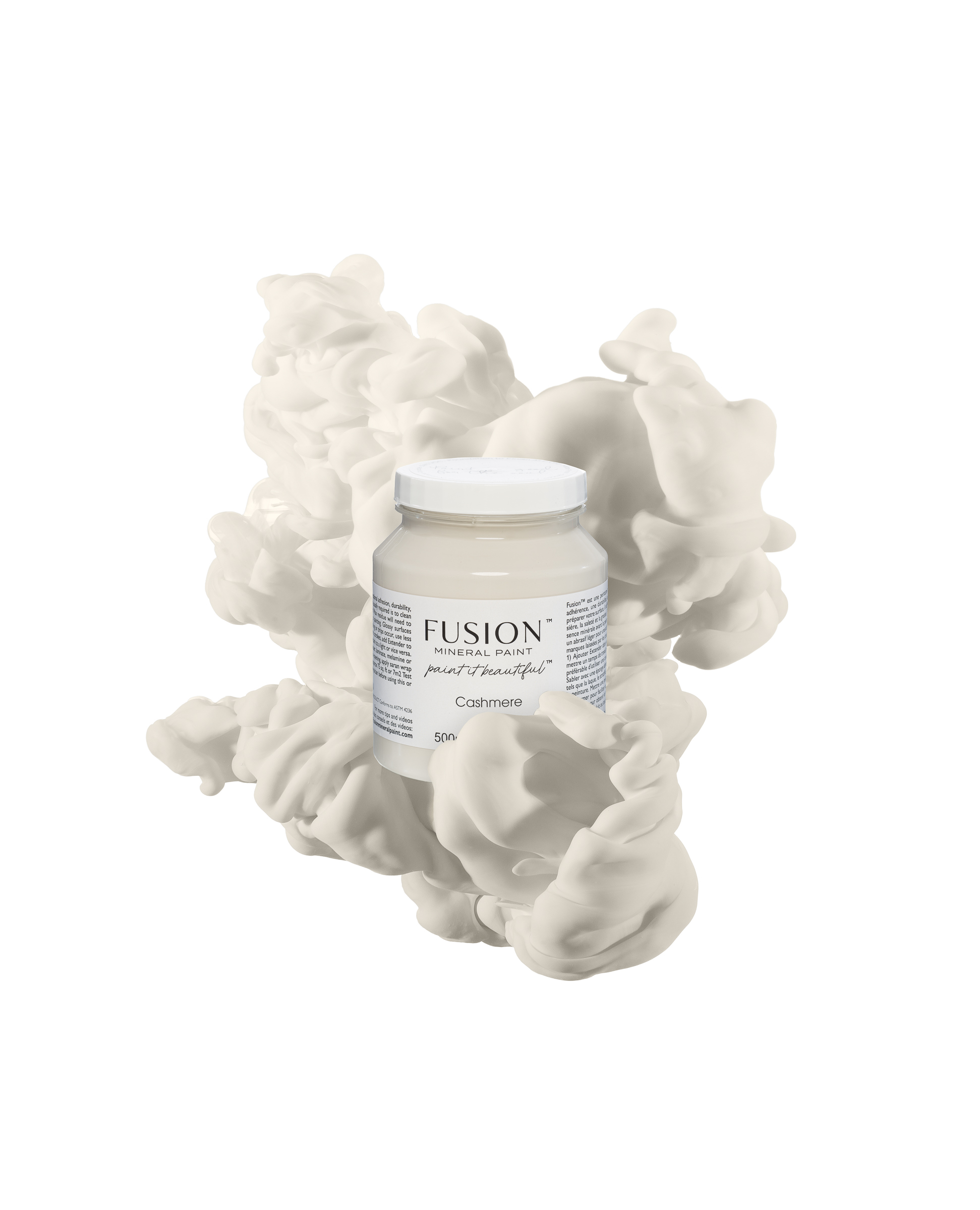
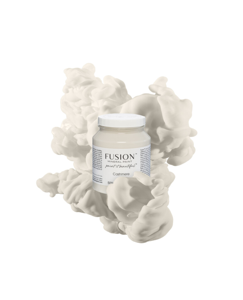
Wrap up in the warmth of this luxurious neutral. Soft and elegant, Cashmere offers a slight cream undertone.
Our Paint It Beautiful Facebook page features thousands of fusionista’s sharing their inspirations, creations and advice! Check out some of our favourites.
As a solid colour, Cashmere is soft, calm, and timeless. It has a gentle warmth that works beautifully on statement pieces without overpowering them. Frances Blaha Hedblom’s chest of drawers and Lady Jane’s Swedish Mora clock are perfect examples of how Cashmere brings elegance and balance while still letting the details and character shine through.


Used as a wash, Cashmere really comes into its own for toning down strong orange hues while allowing the natural grain to show. You can see that subtle, thoughtful approach in Susan Kilby Honderich’s cedar chest and Natalie Wilkins’ wall unit.


And it doesn’t stop at furniture. Trudy Sally Granger’s chair shows how Cashmere can even be worked on fabric!

One colour, many ways to use it — solid, a wash or painted fabric. Cashmere adapts beautifully, which is exactly why it continues to be such a favourite.

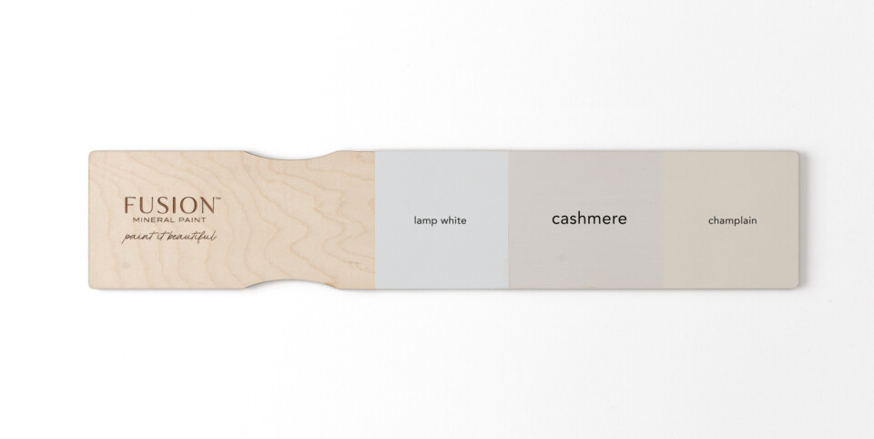
Directly compared to our Lamp white on the left you can really see the cream undertone, however, when compared to Champlain on the right, it’s much more subdued and soft, leaning more towards a neutral slightly grey undertone. This gorgeous neutral is bound to be a pillar colour in your home decor.
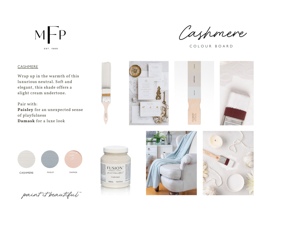
Pair with Paisley for an unexpected sense of playfulness or Damask for a luxe look.
Share your projects with us on Paint it Beautiful! Let us know if you love this colour too! Share your work with us and be sure to tag us @fusionmineralpaint on Facebook and Instagram. We just love seeing what you all create.