Last year, we ran a weekly feature that showcased each one of our beautiful colors every Monday. We loved doing that but wanted to take things a step further. Jennylyn Pringle (you can find her Instagram right here!) is always cooking up ideas for how she can further inspire you, and this year we are so excited to introduce our monthly Fusion Color Story feature! Every month we will be sharing a color combination inspired by real life, to help you with your paint projects! New year, new approach – we are so excited to share January’s Color Story from Fusion Mineral Paint .
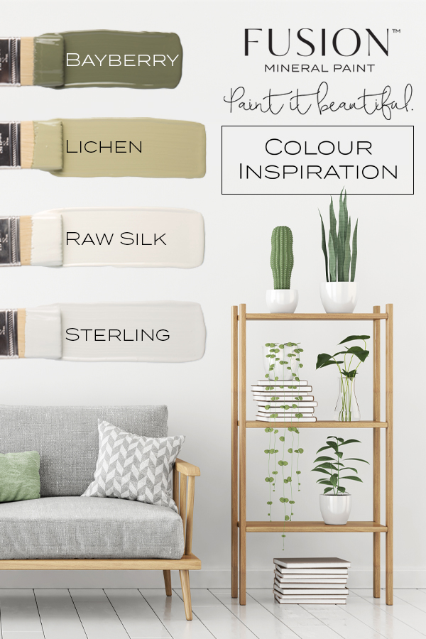
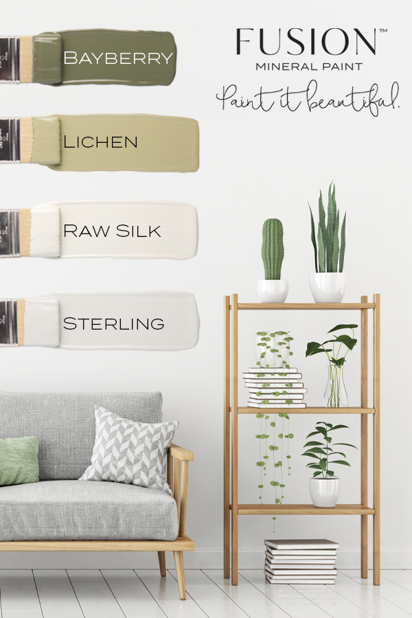
This month’s Color Story is simply stunning – Bayberry, Lichen, Raw Silk & Sterling. Pulling from real-life elements from this beautiful living room scene, Jennylyn sees Fusion colors come to life in the plants, decor and furniture.
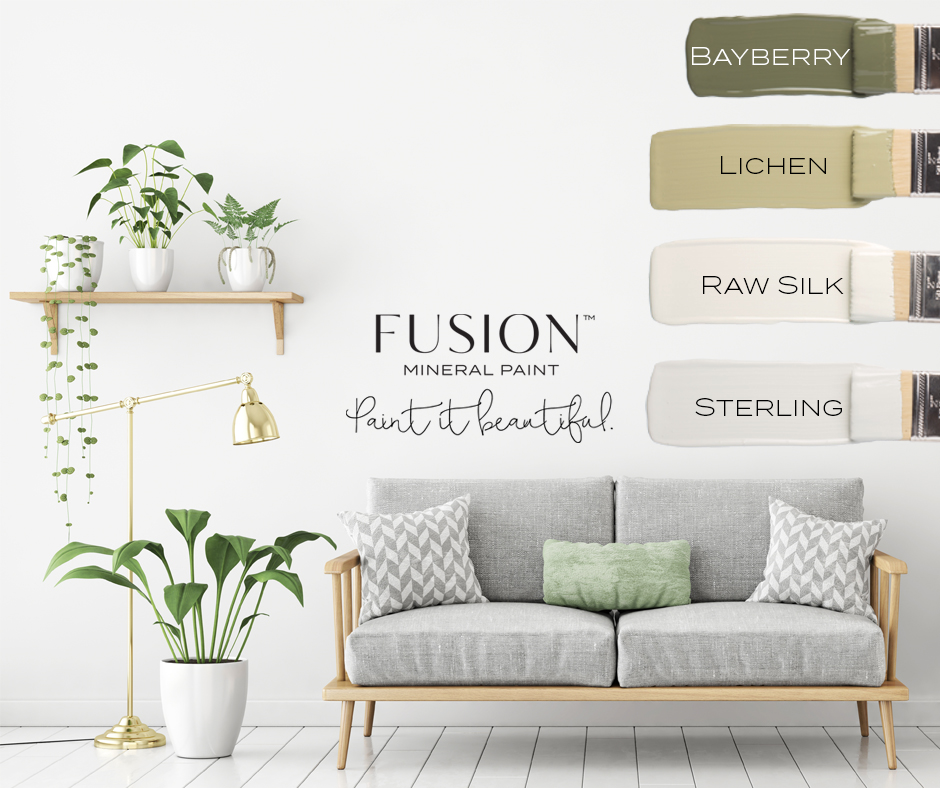
We have seen so many projects done using Lichen and Bayberry over the past year that we knew we had to feature those colors first thing in 2019! Greens are going to be EVEN bigger in 2019.
January’s Color Story from Fusion Mineral Paint
We were looking for something fresh and simple, wanting to spread a theme of keeping our lives simpler. January is about refreshing after the busy holidays and often sets the tone for the rest of the year. This color story gives us the idea of a clear and collected head space and minimalism in our place of work so we can focus on what we need to focus on. We wanted a natural element to remind ourselves to stick with what we know best and what comes natural to us.
Many of the projects we see Bayberry and Lichen used on are very warm and cozy, which is great, but we wanted to show you something a little different! That is, how to pair them with cooler colors like Sterling. We often also see these greens and Raw Silk used in a vintage decor inspired settings but this shows you how they can be modern too!
Let’s dive into some of these gorgeous colors shall we?
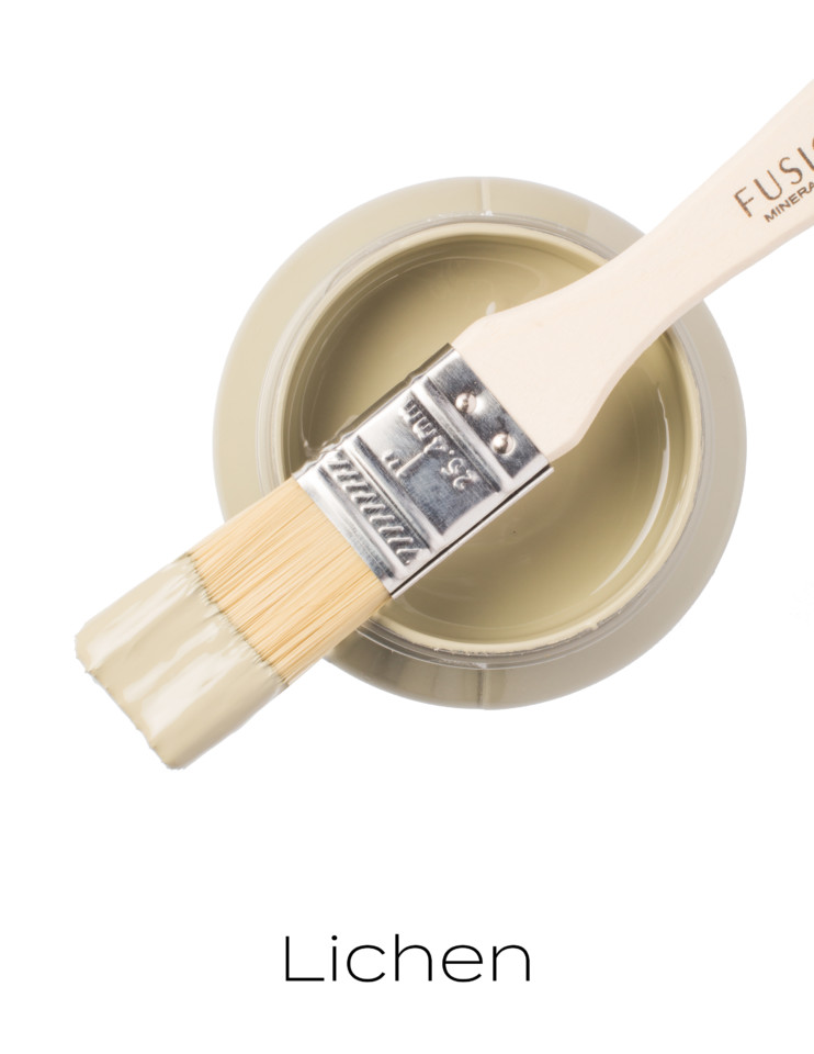
Lichen
Drawn from nature this grey-green is soft, subtle and soothing. Fun fact – Lichen is the moss-like plant that grows on tree trunks and it gives a rustic, back-to-nature vibe.
Bayberry
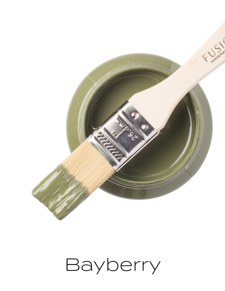
A deep muted olive green, vintage in nature. Stunning on its own or accompanied. This is an impressive deep muted green that adds an edge of nature. This color seems to have been everybody’s favorite darker paint lately. From farmhouse decor to modern finishes, it has been everywhere!
Raw Silk
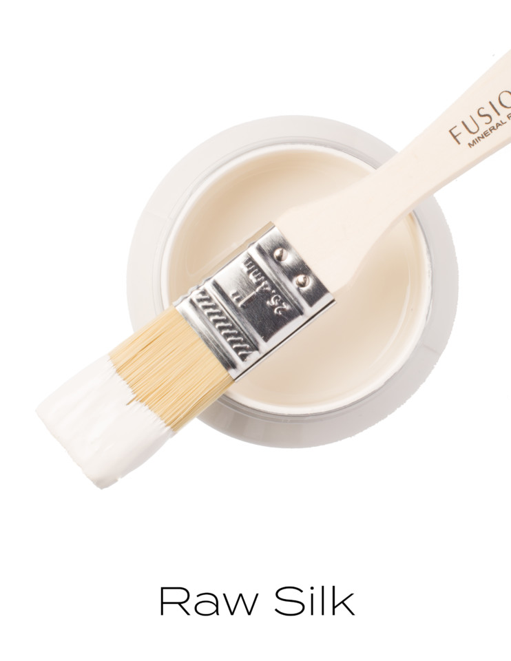
A warm old white with barely a hint of yellow and just a touch of grey. This perfect off-white adds a sense of simplicity in every element. This color is Jennylyn’s favorite even before it was a Fusion color. It was originally part of Homestead House’s Craftsman Collection, which was inspired by the textures and tones of classic construction and design elements. It is the most neutral off-white you could ever find, matches just about everything and fits into any design aesthetic.
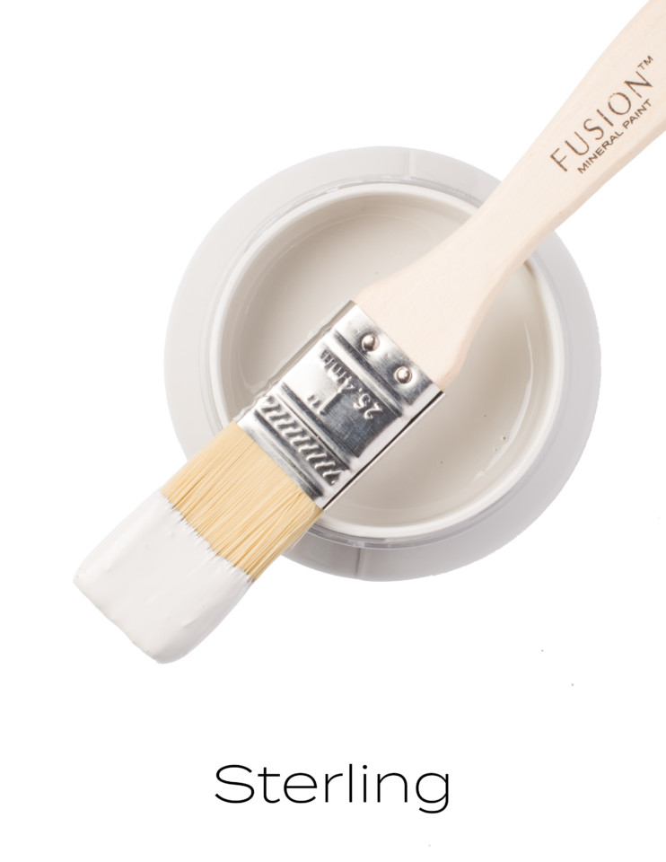
Sterling
Everyone’s favorite cool, neutral grey that is aesthetically calming – it can also be used as a base coat when transitioning from darker to light colors. We find Sterling gives a refreshing touch to this palette as it ties the colors together, due to its contrasting coolness. At the same time, the other colors also work to warm it up and give Sterling a new take on life. For those who lean towards the warm off whites and are looking to add something new, maybe Sterling is what you’re looking for.
Why did we decide to do the color stories? We get asked how to put together a color palette all the time, as well as how to incorporate a Fusion painted piece into a room. Sometimes it’s a simple as “What color should I use?!” because our customers are not sure of which direction to go in for a given piece.
We decided to take professionally curated images and show you how to pick a Fusion palette out of that beautiful image, encouraging a higher level of design inspiration for our Fusion community – who are ready to dive further into the Fusion world. We also want to encourage experimentation with different color pairings, different design aesthetics and how you can then incorporate them into your interior design and everyday life.
Every month we will be featuring a new beautiful image matched up with a palette of Fusion colors, all to inspire you to Paint it Beautiful! We hope you love it as much as we do.
PIN IT FOR LATER!


One Response