

Every month, our Paint It Beautiful community continues to inspire us with bold colour choices, flawless finishes, and creative transformations. February was filled with rich tones, dramatic contrasts, and statement pieces that prove once again — anyone can paint it beautiful.
Here are our Top 10 February favourites and why we love them.
Damask – A Statement in Sophistication
Damask never disappoints.
This project shows exactly why this deep, moody neutral has become a favourite. It’s dramatic without being overpowering, elegant yet modern. The richness of Damask instantly elevates a piece, especially when paired with updated hardware.
Why it works:
Dark neutrals like Damask create instant contrast and sophistication while still feeling timeless.
See the transformation here:
https://www.facebook.com/share/p/1Ajm9hL7wb/?
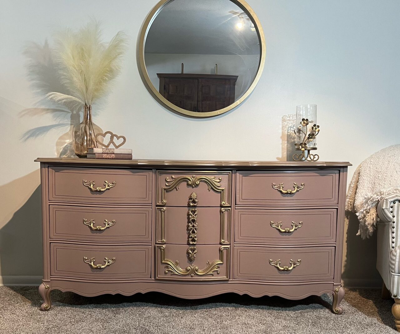
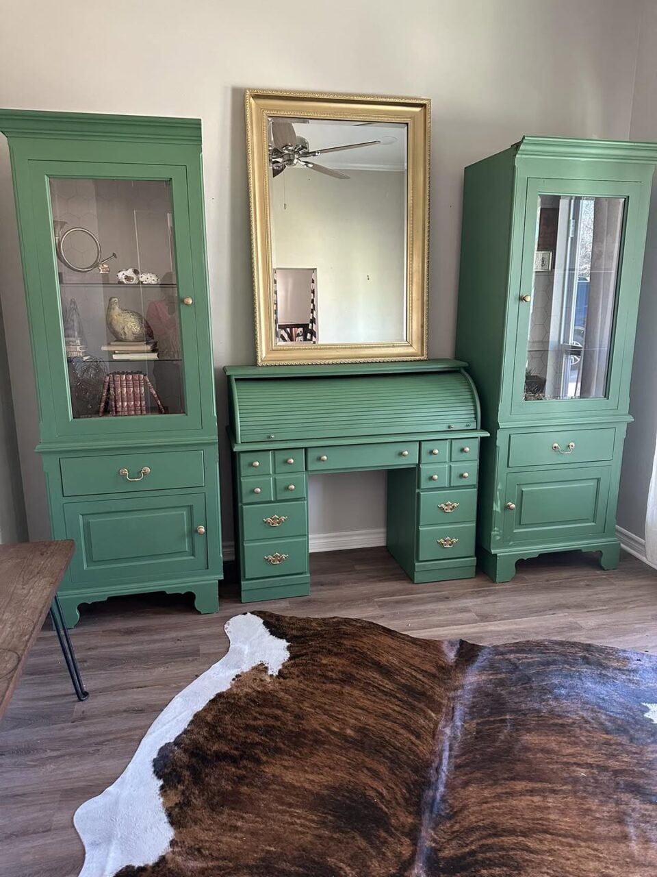
Carriage House – Classic & Refined
Carriage House is one of those grounding neutrals that works in almost any space.
This makeover showcases how a strong mid-tone neutral can warm up a piece while still keeping things classic and versatile.
Pro Tip:
Neutrals don’t have to be boring. Depth of undertone is what makes a colour feel rich rather than flat.
View this project here:
https://www.facebook.com/share/p/1BZBL4zPAb/?mibextid=wwXIfr
Wood Wick – Soft & Organic
Décor Deuxième Soufflé brought Wood Wick to life beautifully.
Wood Wick is a soft, earthy neutral that gives furniture that organic, high-end feel — especially when paired with natural textures and subtle styling.
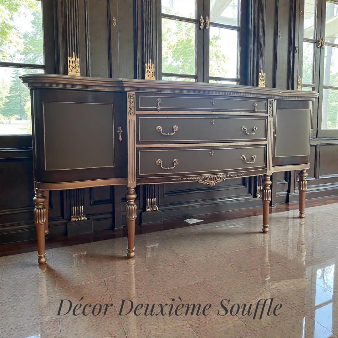
Why we love it:
It’s the perfect shade when you want warmth without going too beige.
See it here:
https://www.facebook.com/share/p/1RgdxM8KZc/?mibextid=wwXIfr
Mustard – Bold & Playful
T&C Re-Creations reminded us why Mustard is such a standout.
This rich golden yellow adds personality instantly. It’s cheerful, confident, and perfect for accent pieces that deserve attention.
Colour Tip:
Mustard pairs beautifully with deep blues, charcoal tones, and natural wood for a balanced look.
Check it out:
https://www.facebook.com/share/p/1DYBofU5y4/?mibextid=wwXIfr
Park Bench – Deep, Dramatic Green
We saw Park Bench twice this month — and for good reason.
Hectate Design showcased how this deep green can feel both bold and classic at the same time. It’s rich, grounding, and perfect for statement furniture.
Why this colour shines:
Dark greens create drama while still feeling connected to nature.
See the Park Bench transformation: https://www.facebook.com/share/p/1ENyChLEx6/?mibextid=wwXIfr
Curiously Pink – Unexpected & Fun
Eclectic Gypsy Heart delivered pure joy with Coal Black, Cathedral Taupe, Curiously Pink and Gold Leaf.
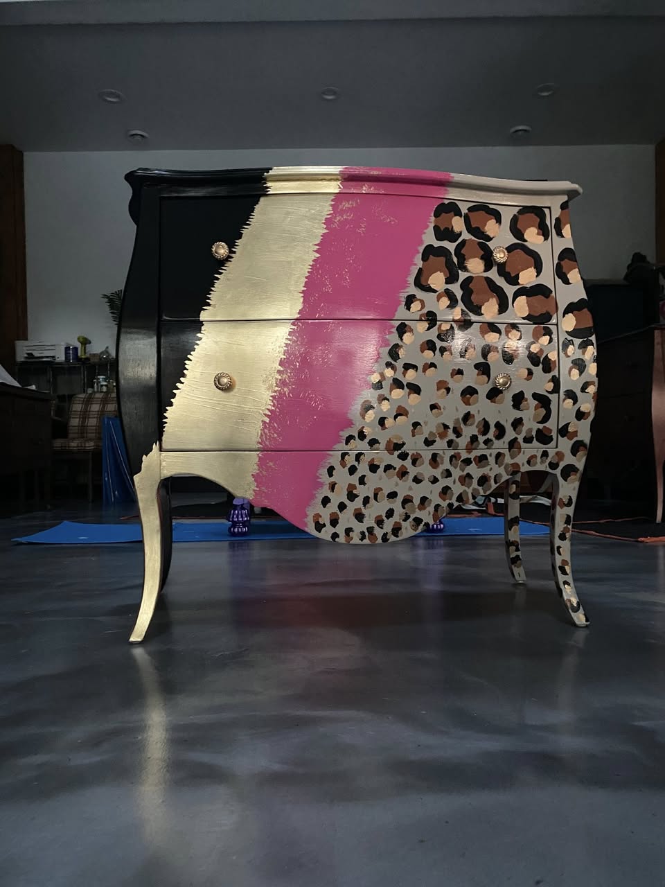
Design Insight:
Pinks work beautifully in vintage silhouettes and feminine-inspired pieces — but don’t be afraid to pair them with modern lines for contrast.
See the makeover here:
https://www.facebook.com/share/p/1EPQHFCg2a/?mibextid=wwXIfr
Coal Black – Always Timeless
Lady Jane demonstrated once again why Coal Black remains a staple.
There is nothing more classic than a beautifully finished black piece. It anchors a room, highlights hardware, and feels polished every time.
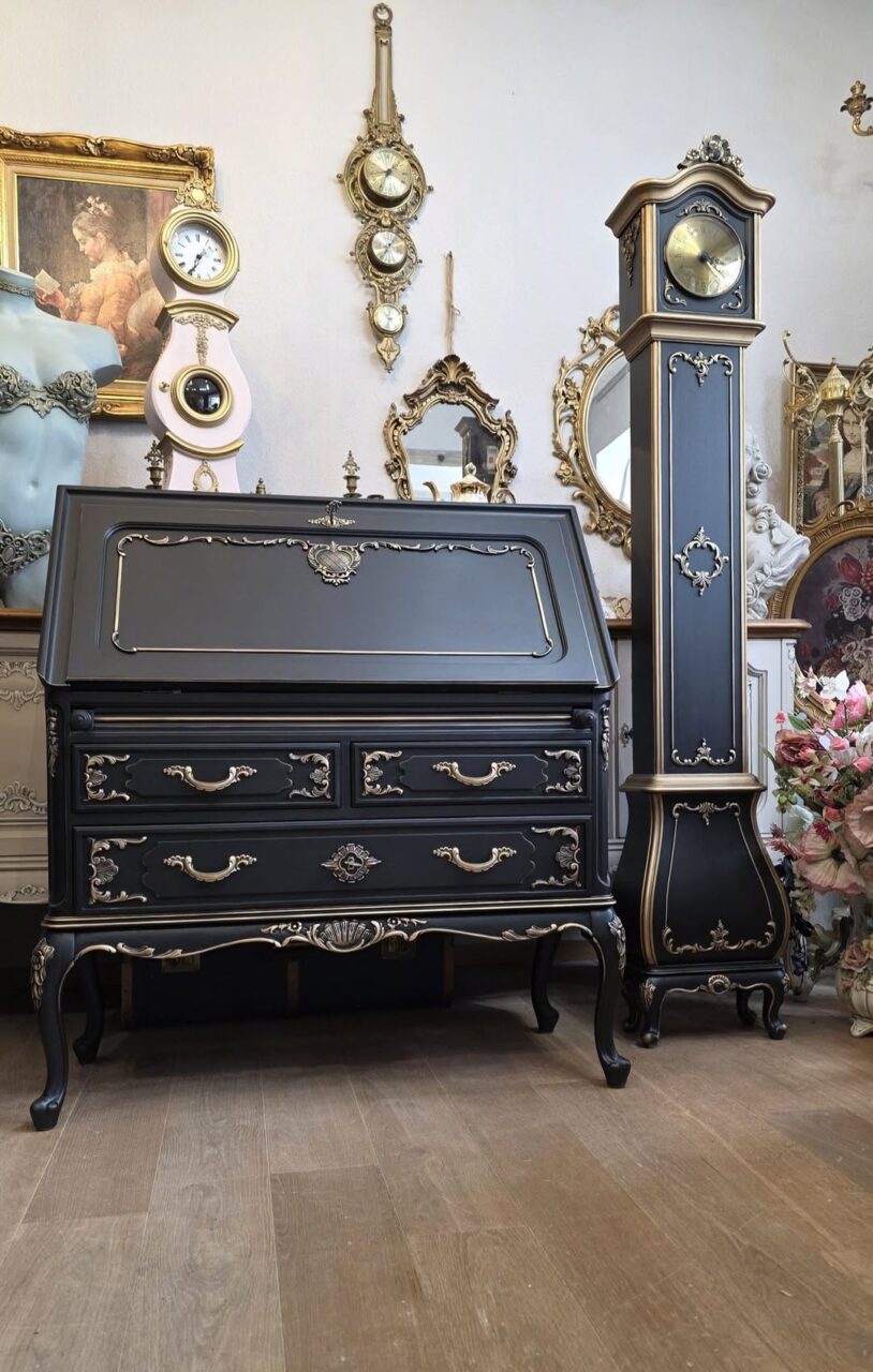
Why Fusion Coal Black performs so well:
It’s deeply pigmented, self-levelling, and gives that smooth, professional finish in fewer coats.
See it here:
https://www.facebook.com/share/p/1AaGeagSWk/?mibextid=wwXIfr
Velvet Plum – Rich & Regal
The Vintage Peony Store embraced bold colour with Velvet Plum.
This shade is powerful and dramatic, yet incredibly elegant. It instantly transforms a simple piece into something luxurious.
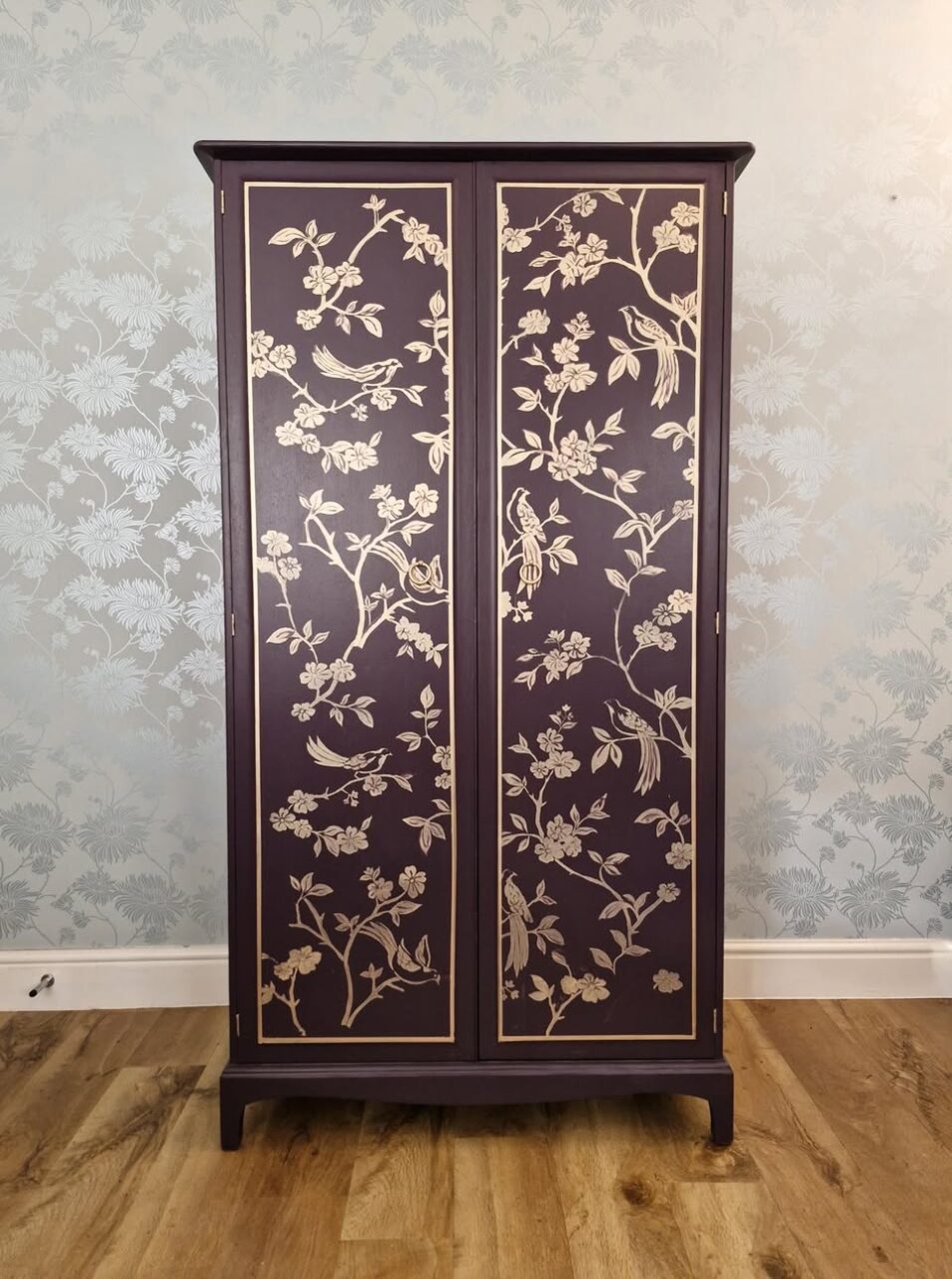
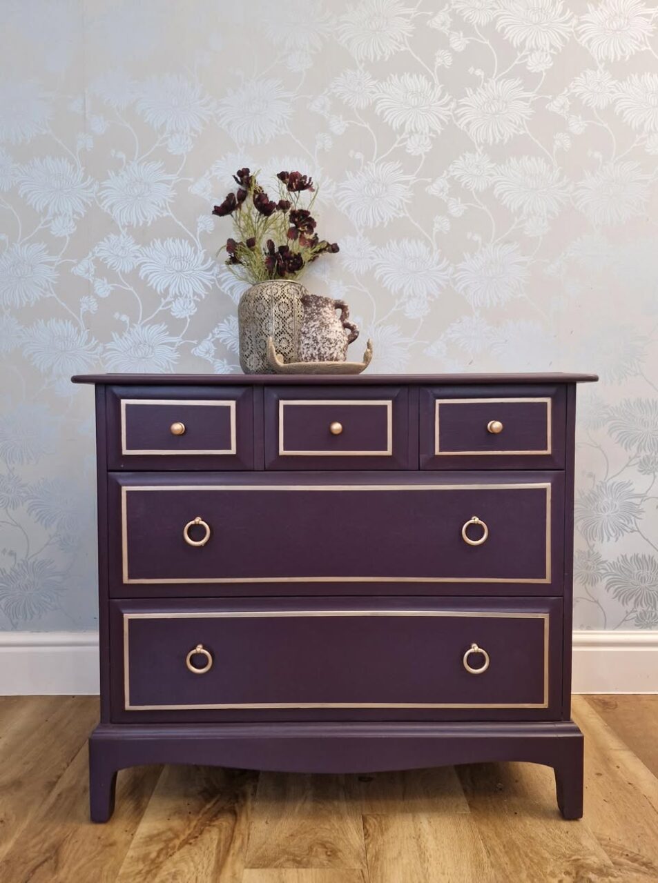
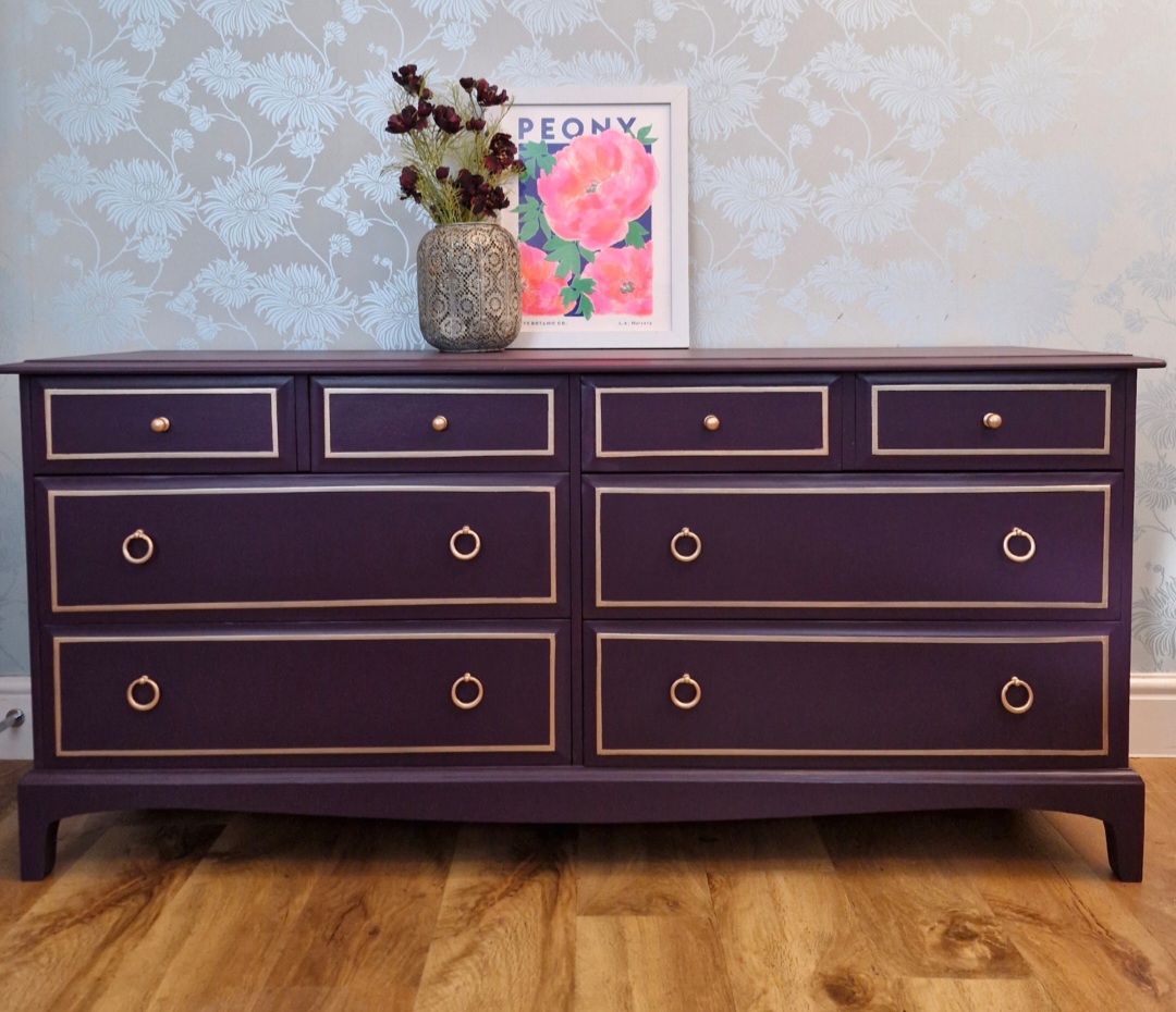
Pro Tip:
Jewel tones like Velvet Plum look stunning with brass hardware or gold accents.
View the project:
https://www.facebook.com/share/p/1CJ2yC7mP1/?mibextid=wwXIfr
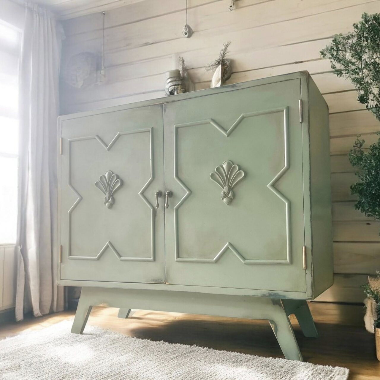
9. Wellington – Understated & Refined
Krafty Kate showcased Wellington in a way that feels calm and sophisticated.
Wellington is that perfect muted green-grey that works in traditional and modern spaces alike.
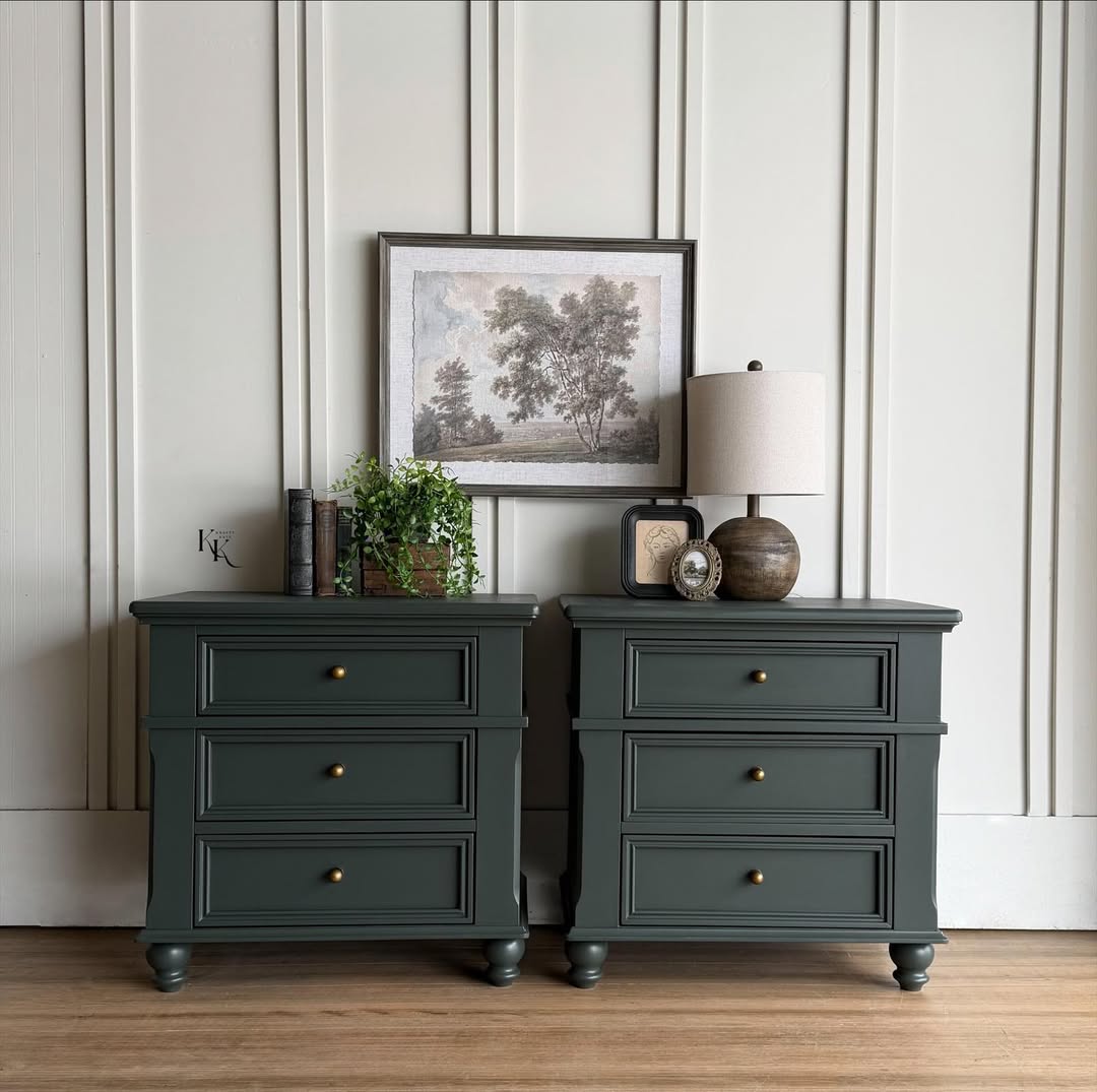
Why it works:
Subtle greens are incredibly versatile and easy to decorate around.
See it here:
https://www.facebook.com/share/p/1Dt8veu4sc/?mibextid=wwXIfr
The Takeaway? Confidence with Colour
From bold Mustard and Curiously Pink to moody Damask and Park Bench, our community continues to embrace colour with intention.
The beauty of working with a high-quality formula is that it allows you to focus on creativity instead of fighting your paint. Strong pigmentation, built-in topcoat durability, and excellent self-leveling make these finishes achievable for beginners and pros alike.
And remember — prep is still the most important step. Clean thoroughly (our TSP Alternative is perfect for this), scuff sand where needed, and apply thin, even coats for best results.
Ready to Start Your Own Makeover?
Whether you’re drawn to rich jewel tones or calming neutrals, there’s a shade waiting to transform your next project.
Explore colours, grab a tester, or invest in a Fan Deck to see undertones in your own lighting. The hardest part truly is choosing the colour.
And if you create something beautiful — share it inside Paint It Beautiful. You might just be featured next month.
Let’s keep painting it beautiful.