")
")

")
")


 (1)")

")


 (1)")


")

")


")


")


")


")
")

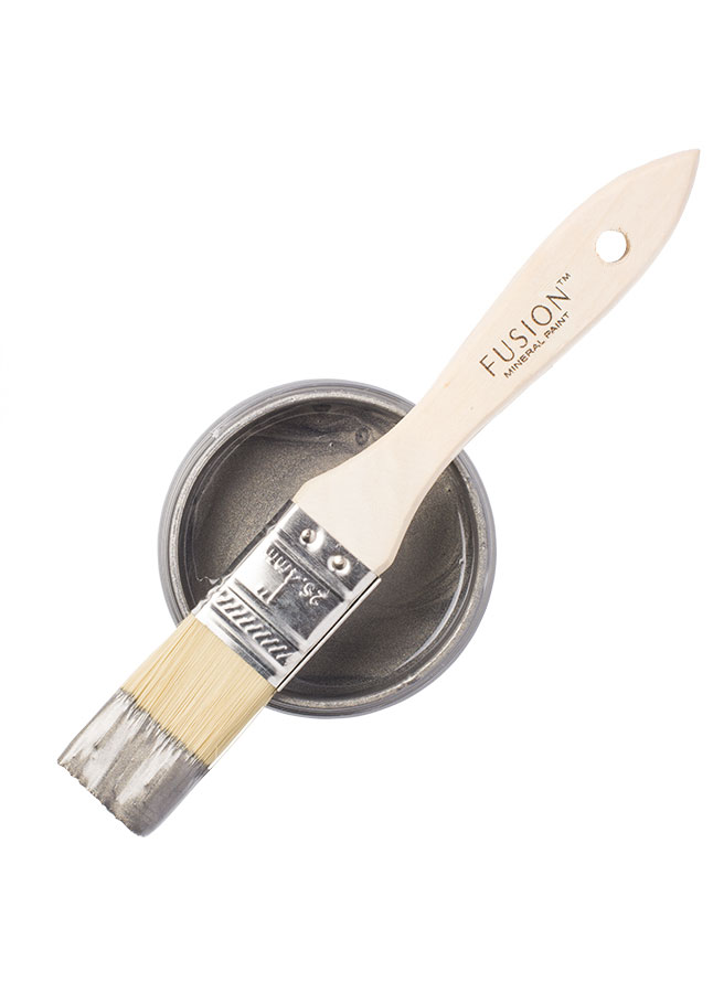


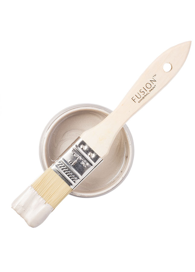

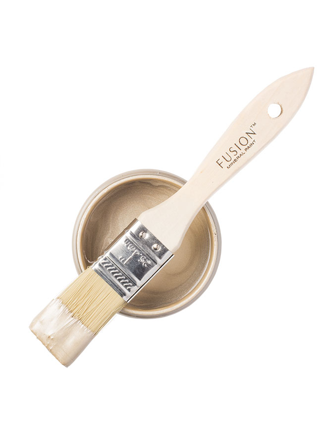
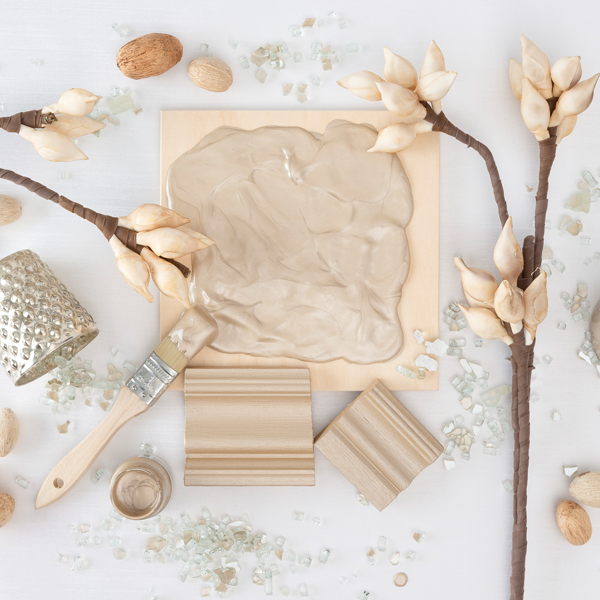
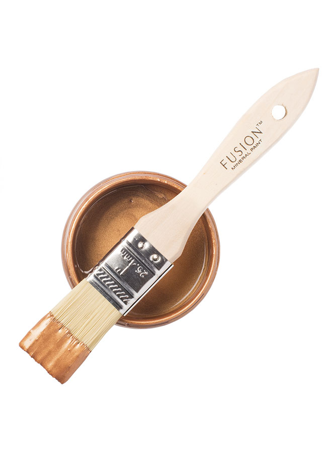

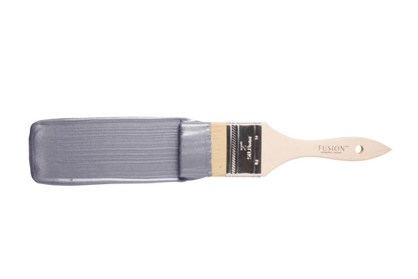

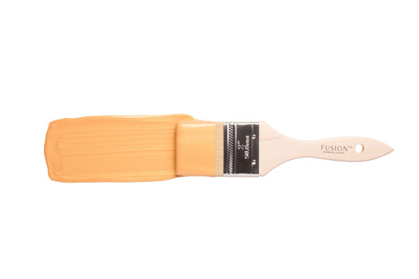


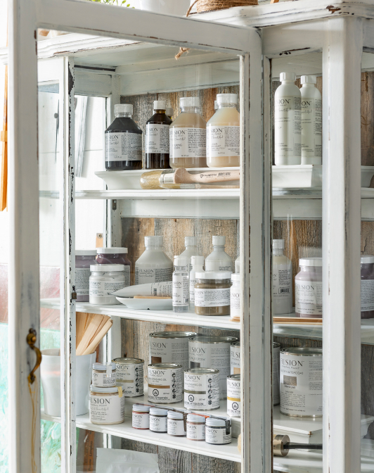
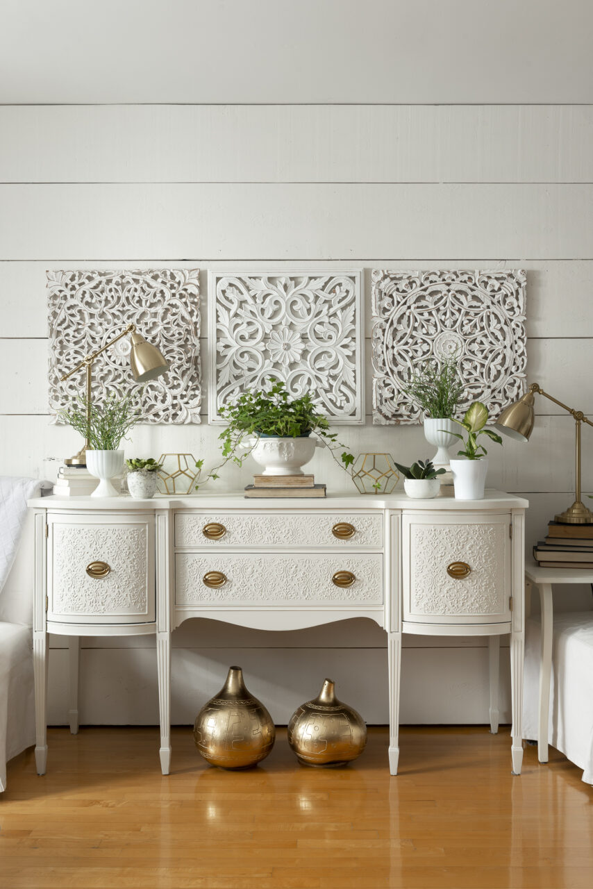
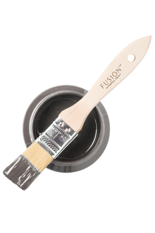
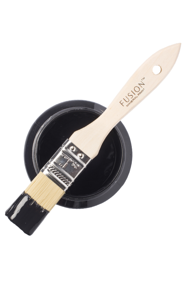
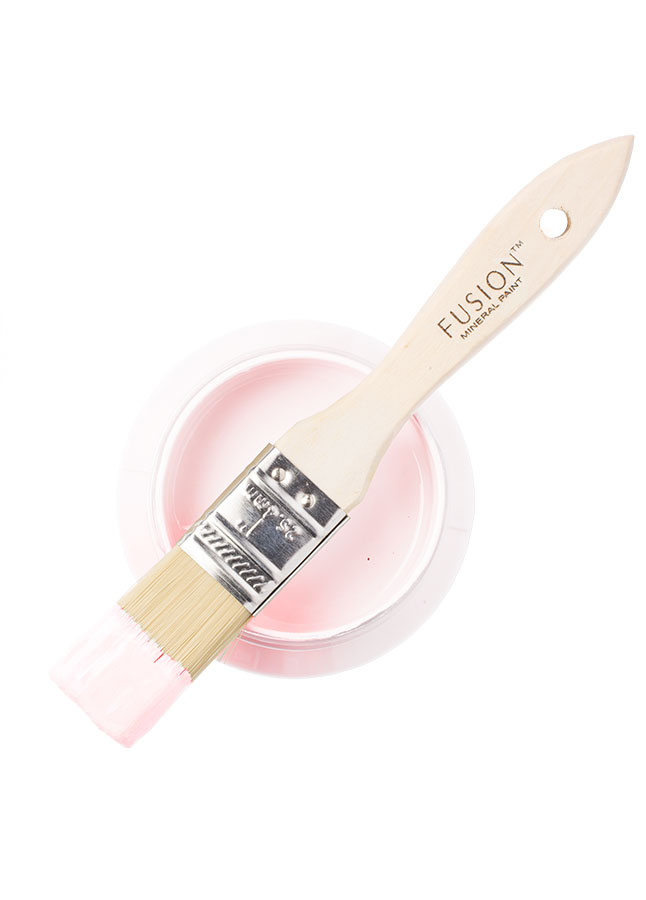
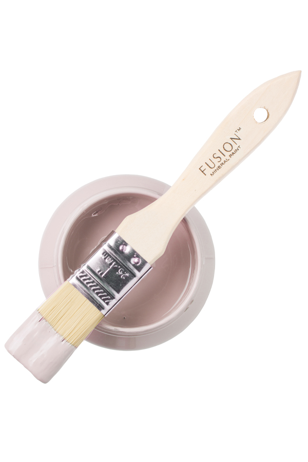
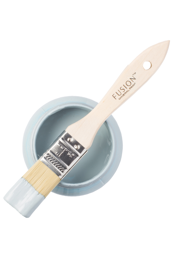
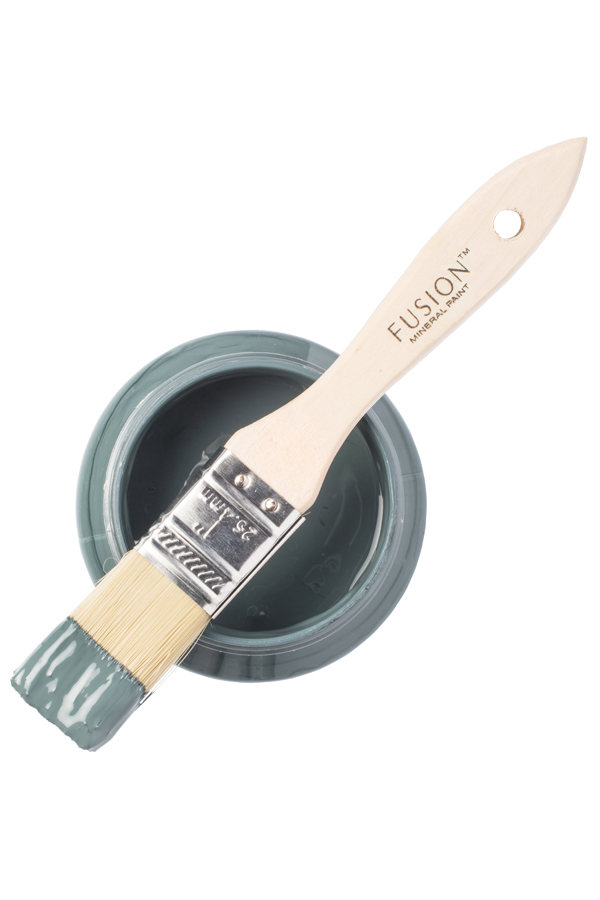
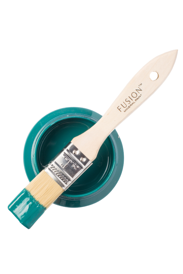
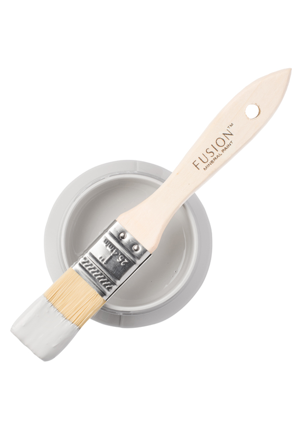
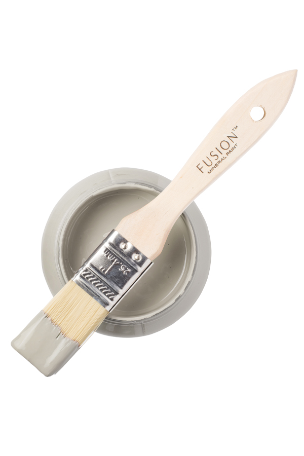
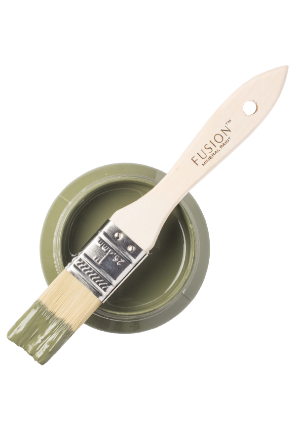
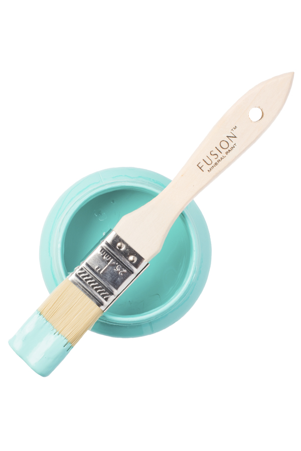
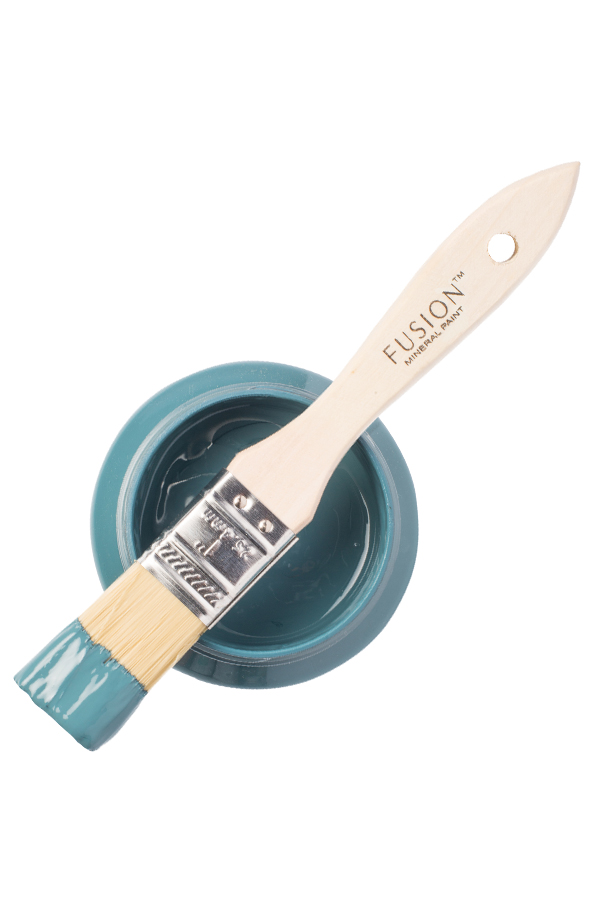
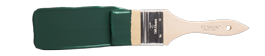
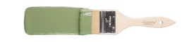
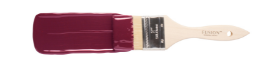
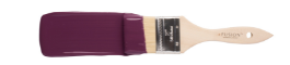
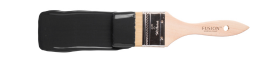
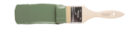
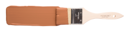
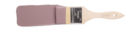
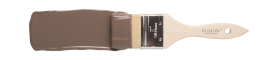
FUSION MINERAL PAINT IS A PROFESSIONAL PAINT FOR THE EVERYDAY DIY’ER.
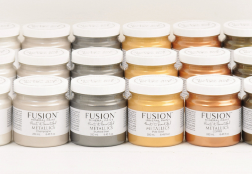
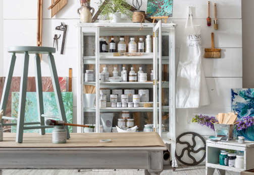
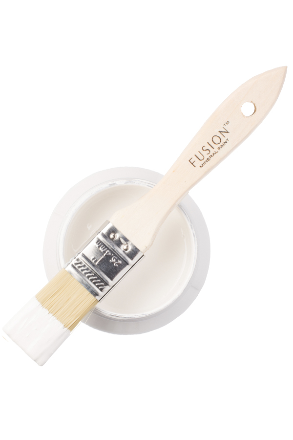
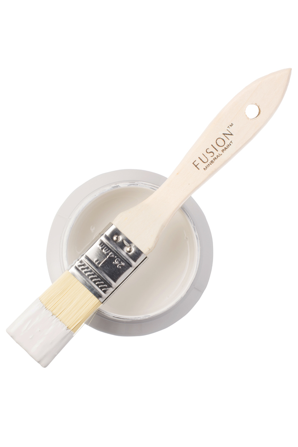
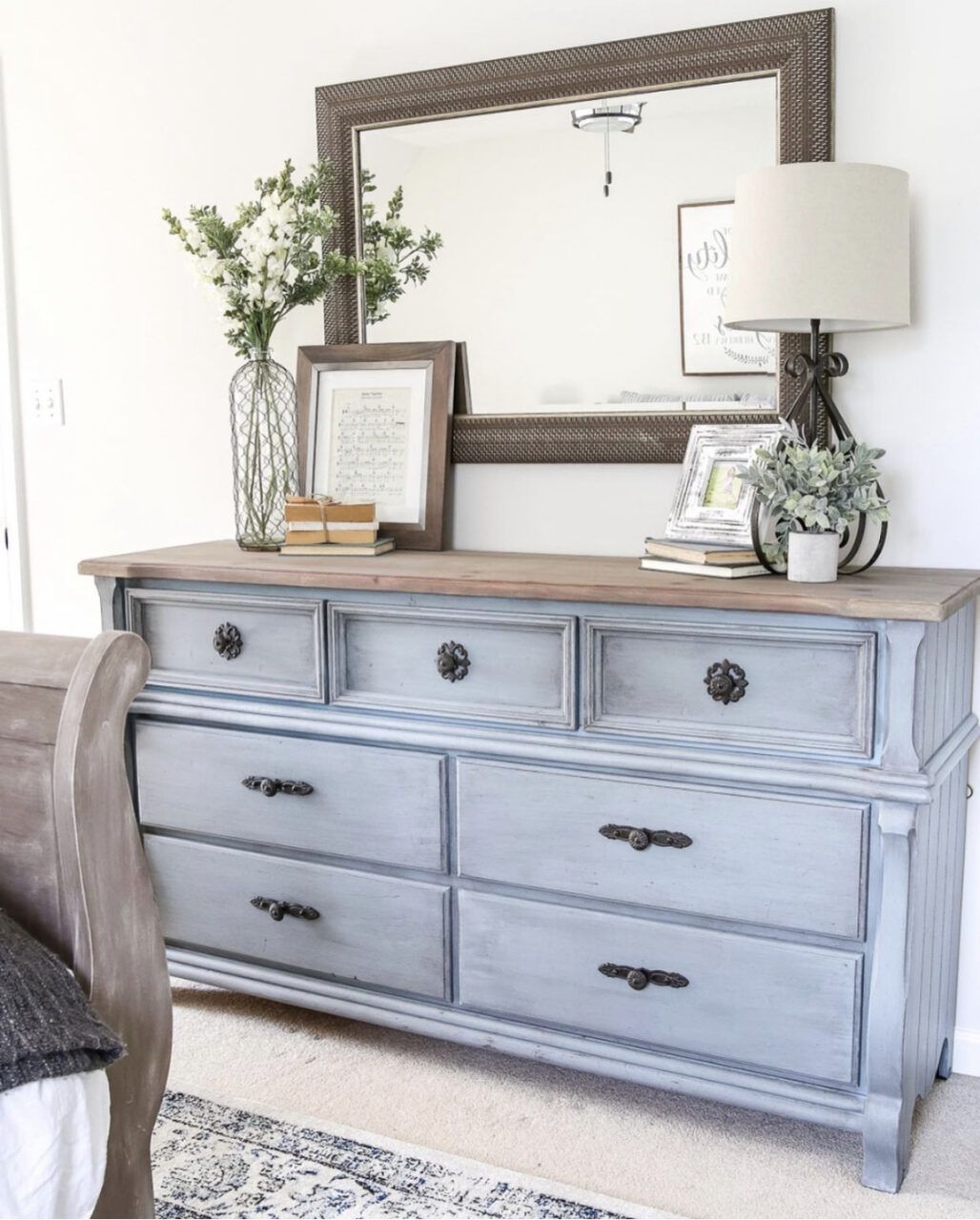
With Fusion™’s exceptional ease of application, high coverage, and a built-in top coat, it’s easy to Paint it Beautiful™! With over 50 gorgeous colours to choose from, you can tackle any project small or large! Go from inspired to admired in a few hours. Add colour, reinvent and enjoy your time to create. Live with things you love and DIY the rest. Pick your project, bring home a pot of mineral inspiration, and Paint it Beautiful™ !
For busy-DIYers, Fusion Mineral Paint™ is the only choice for exceptional colour, coverage and durability. Unlike our competitors, we create our paint from the mineral pigments up and formulate it for lasting results. Our customers return again and again because Fusion Mineral Paint™ is supported by a knowledgeable retail network, that when paired with our product line, makes it easy to Paint it Beautiful™!