Are you ready for the paint color trends for 2019 from Fusion Mineral Paint? For the past couple of years we’ve noticed a shift in paint color trends. For a long time, bright white ruled the design world but lately there’s been a craving for moodier tones. Darker shades and warmer palettes are some of the top paint color trends for 2019. It’s as if we’re asking, where did all the colors go? So we wanted to bring you the paint color trends for 2019 from Fusion Mineral Paint that we think will be huge this year! For all you Fusion fans, you’re going to be thrilled that we already have all that you need to recreate the hottest and on color trends in paint for your home.
2018 saw the beginning of darker greens and blues ruling and those color trends are continuing into 2019. Think warmer, richer and luxurious. Colors that embody the feeling of a warm cup of coffee or your favorite cozy scarf. But cozy doesn’t have to mean color trends for the winter season only. Fusion Mineral Paint’s color trends can span any season. Our neutrals can be mixed with pinks, blues and yellow accents for a seaside cottage feel. All that warm sunlight and beaches! Whatever your color preference is, we’ve got you covered for in our 2019 paint color trends.
Paint Color Trends for 2019 from Fusion Mineral Paint

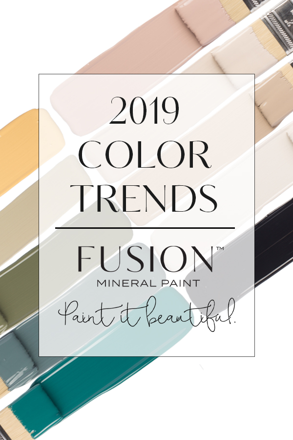
Let’s dive into this gorgeous paint palette shall we? (From top left, going counterclockwise)
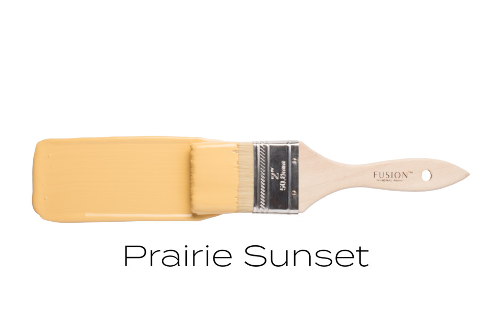
PRAIRIE SUNSET
Not too bright and not too pale, Prairie Sunset is the yellow for everyone who did not know they could love a yellow color as much as this one. Evoking soothing undertones, it’s a calming shade as much as it is a cheerful one. We can absolutely see this one being a great statement piece!
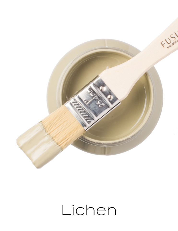
LICHEN
We notice when colors start to take off and Lichen was easily the most tagged color on our social media platform as of late. When you see it first in the container, it looks simple. Almost plain in nature but it’s anything but plain. This gorgeous green grey is so easy on the eyes, it’s perfect for painting doors, side tables and is much loved by the farmhouse decor crowd. We can only see this color growing more popular so we had to include it in our color trends for 2019!
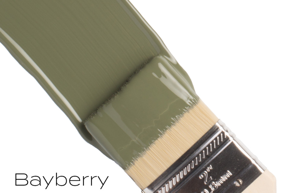
BAYBERRY
Oh Bayberry! Right up there with the little color that grew and grew. By the end of last year, this color had taken the furniture painting world by storm because it honestly goes with just about everything. We can’t see this color slowing down in 2019 either. This muted olive, inspired a lot of vintage projects and yet felt fresh at the same time. If you’re looking for something different than our tried and true Midnight Blue, give Bayberry a chance!
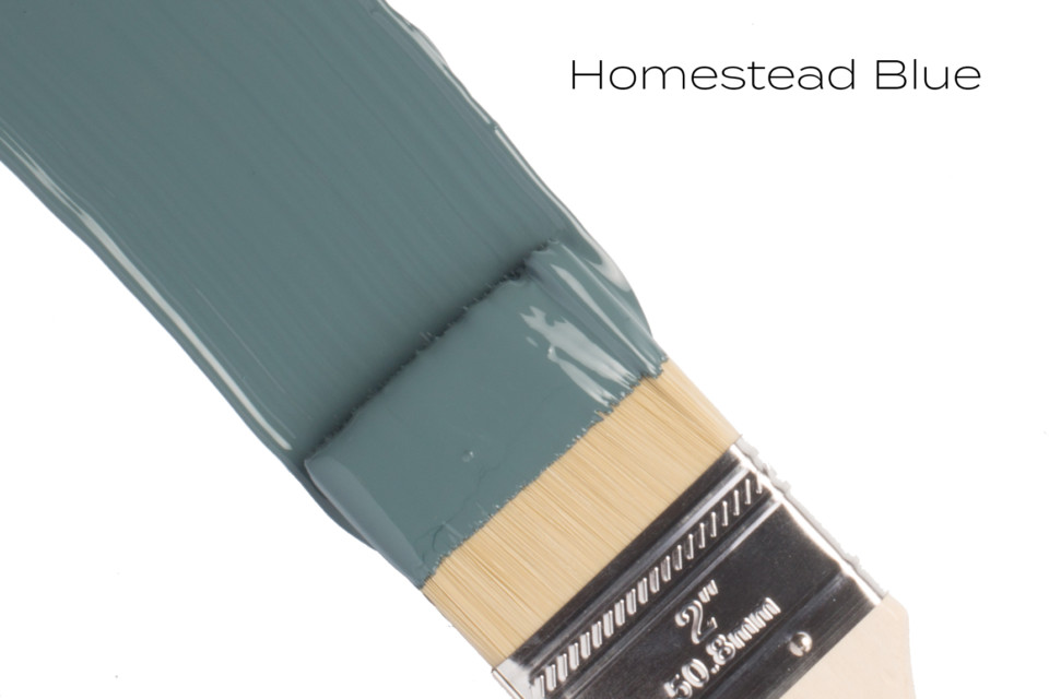
HOMESTEAD BLUE
This one will never go out of style. It has stood the test of time, 30 years to be exact, being one of our original colors in the Homestead House Canadiana line. With its grey and muted teal undertones, Homestead Blue goes well with deep yellows, reds and all neutrals. It is a favorite of farmhouse decor painters but also lends itself to the Mediterranean aesthetic. Which we’re putting it in with our paint color trends for 2019, this one is a classic.
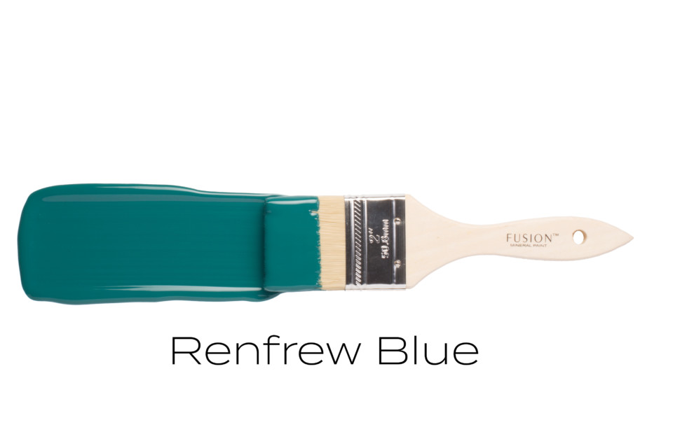
RENFREW BLUE
When you look at this teal blue, you can envision it anywhere from a dining chair in a country home to a Mid Century Modern dresser. It commands your attention without being brash and almost always makes you take a second look. Pairs well with greys and taupes like Bedford and Putty.
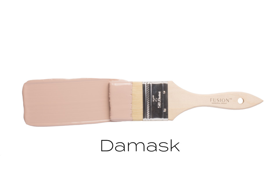
DAMASK
Inspired by a trip to Paris where hints of this color were popping up everywhere, Jennylyn Pringle knew they had to bring back an updated version of our old favorite, Damask. This dusty rose is a perfect alternative to English Rose, that vibrant, millennial pink that everyone could not get enough of. Think of it is as the more sultry, mysterious pink. You will absolutely want to get this as soon as you can because our merchants say it flies off of the shelves!
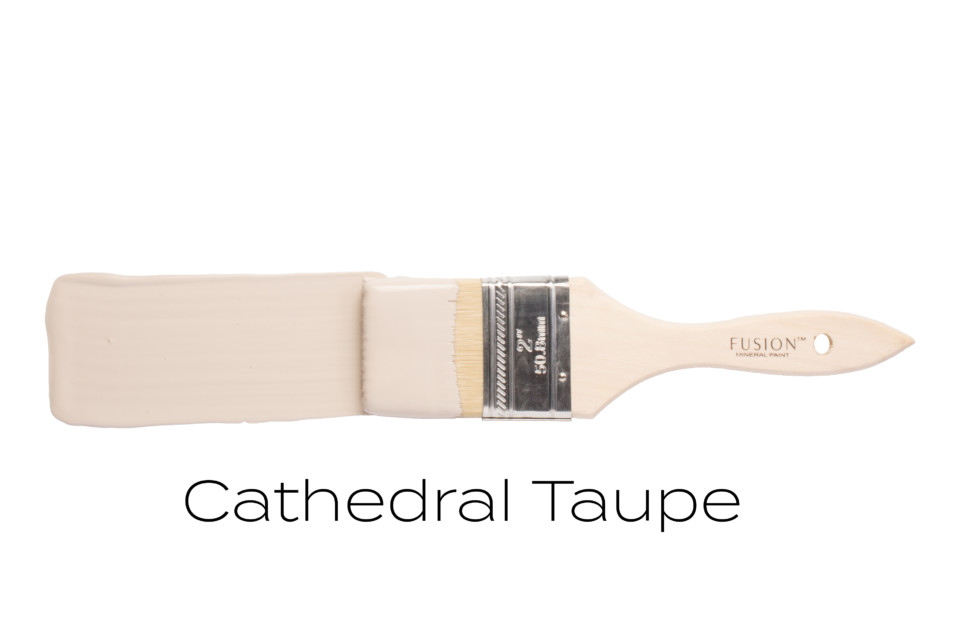
CATHEDRAL TAUPE
That amazing Custom Color Pink we made? Cathedral Taupe had a hand in that. Not the Taupe of yesterdays dated decor, this one features pink undertones that will never have you seeing Taupe the same way again. It goes with virtually everything. Use it on your walls to a table and even planter pots.
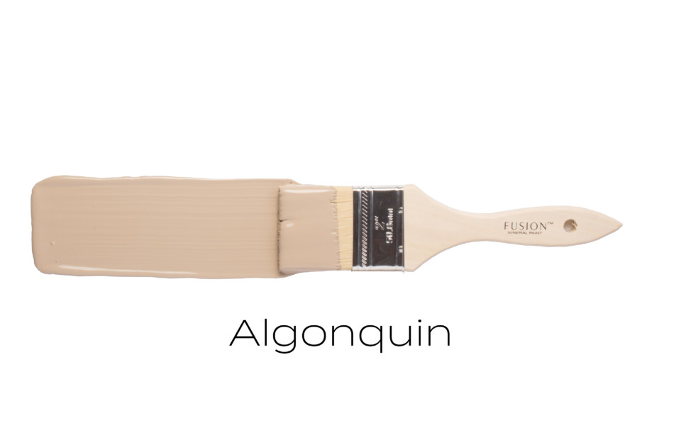
ALGONQUIN
Is this neutral colour a yellow-beige or a brownish-grey or a grey-sage? It changes depending on your lighting situation but it is deep taupe and you can pair it with other colors to accentuate them. We think it looks gorgeous with Renfrew Blue and Bayberry.
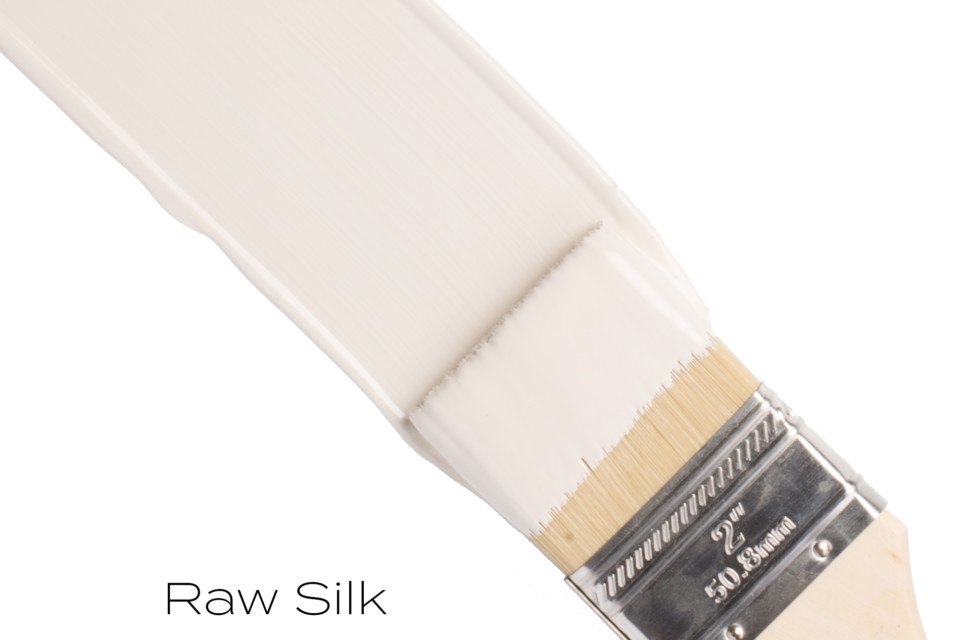
RAW SILK
What can we say about our top-selling paint color? It is the perfect white, with barely a hint of yellow and just a touch of grey. Raw Silk has been used in every single decor scheme from Shabby Chic to Farmhouse to even modern spaces. It is one of our most popular colors used on kitchen cabinet makeovers and we can’t blame them. An absolute classic.
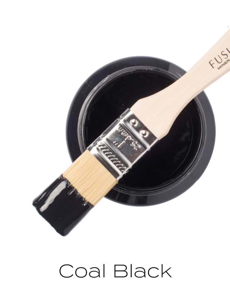
COAL BLACK
We’ve never seen a piece painted in Coal Black that we didn’t like. It’s the little black dress of your paint collection, something you turn to when you know you need that perfect result. It is a true jet black. Pair it with a metallic paint or gold leaf for a dramatic sideboard makeover or use some beeswax and give it an aged vibe with some vintage knobs on a dresser. You really can’t go wrong with Coal Black.
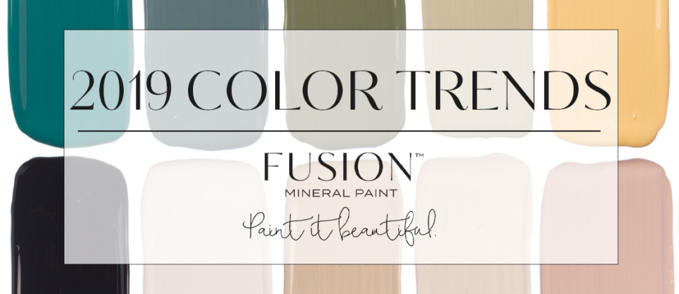
So there we have it. Fusion Mineral Paint’s Color Trends for 2019! Which combination do you think you will use for your projects? Do you have a favorite color from this list? Let us know!
Don’t forget to share your paint projects with us in our Paint it Beautiful Facebook group or tag us on social media with #FusionMineralPaint and #PaintItBeautiful
PIN IT FOR LATER!


2 Responses