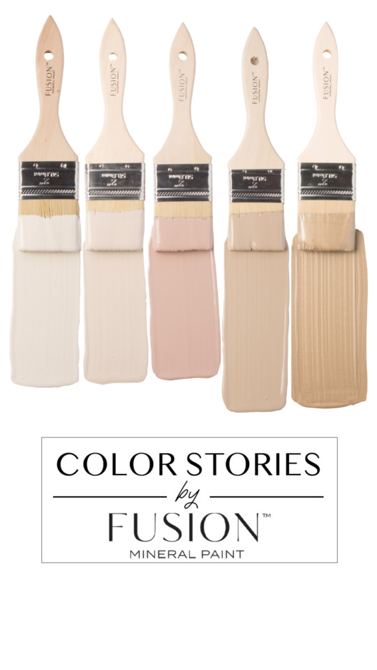
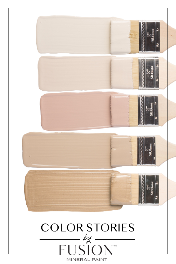
May’s Color Story is all about that muted touch of femininity and shimmer. Inspired by the new blooms of May, this colour story is soft and relaxing, with a focus on renewal. It’s about preparing yourself for the busy summer season and restoring yourself from the often dreary winter (especially this year in Canada it has lasted such a long time into the spring months). The colours featured in May’s Color Story evoke tranquillity and elegance and are a colour palette sure to soothe. We’re ready to welcome the warmer winds in the air, how about you?
Let’s take a deep breath and fall into May’s Color Story!
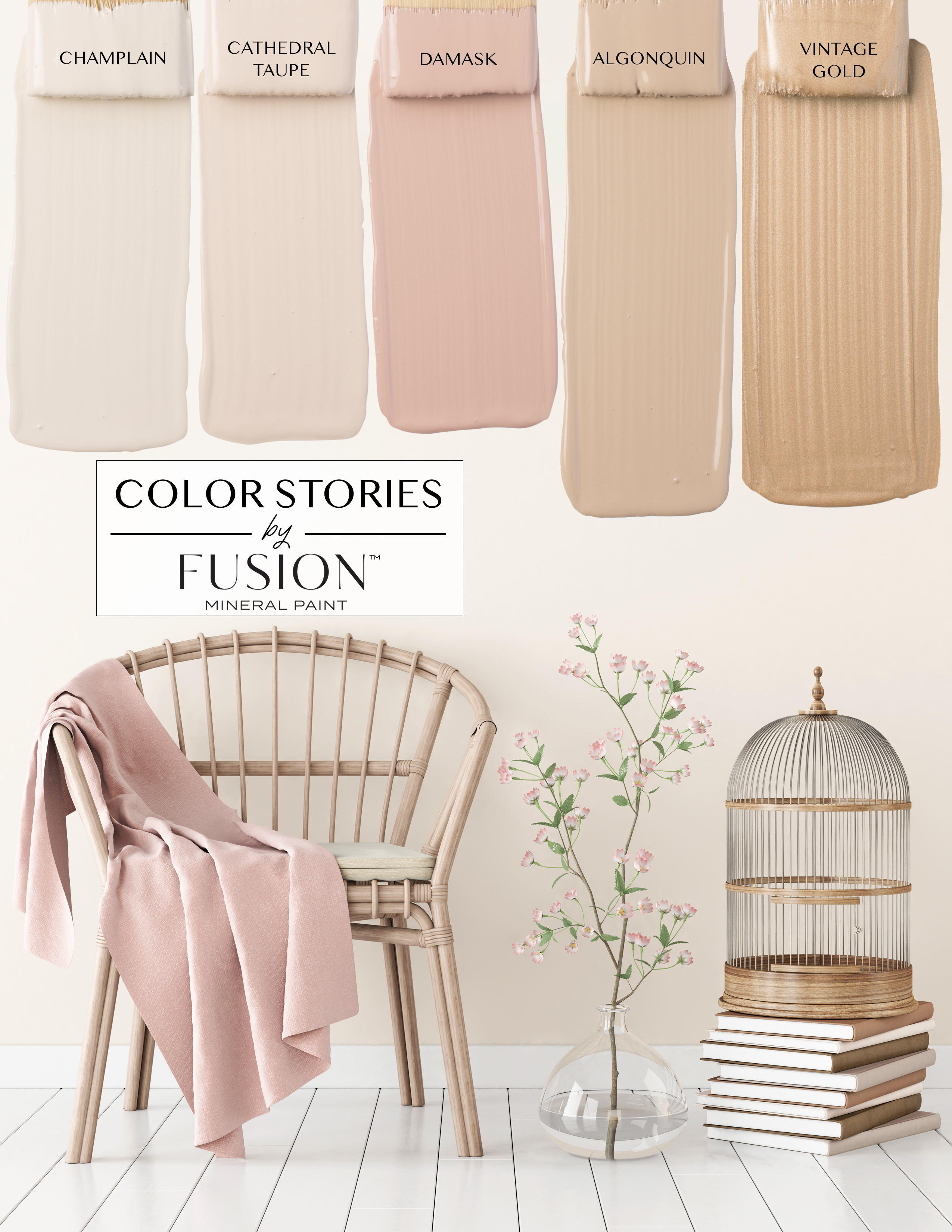
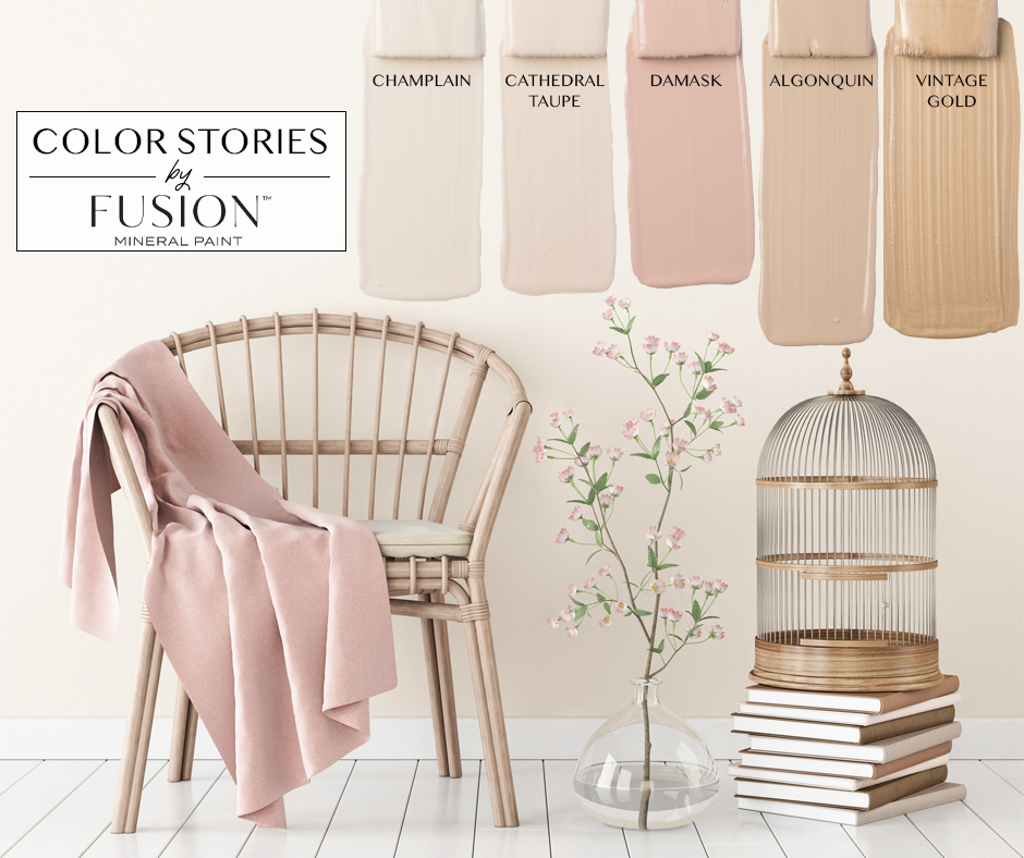
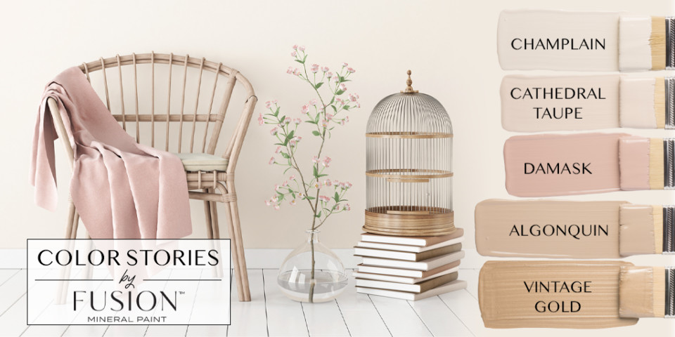
The inspiration image we selected for May’s Color Story is simple and quiet with intention. The word soothing comes to mind when you look at it. Peaceful. Feminine. With touches of shimmer in all the right places. Neutral can be anything but boring. We can see this colour palette being used in a bedroom in a country cottage, a Mother’s Day brunch tablescape and even your kitchen dining area.
We start with Champlain, a classic off-white which is a great base for walls or any project. Moving into Cathedral Taupe, a colour that is so underrated and then when you pair it with the likes of Damask, suddenly the hints of pink undertones just appear where you didn’t notice them before. Damask was brought back to Fusion Mineral Paint’s collection this year due to the demand for a more sophisticated millennial pink. This dusty vintage rose paint colour is so beautiful, it matches everything and every home decor genre. Grounding the other colours is Algonquin, a deeper taupe which tends to change its colour tone depending on the lighting situation. Finally, who says you can’t add shimmer to a neutral palette? Our Vintage Gold is the perfect dusting for this layer. May’s Color Story from Fusion Mineral Paint is sure to be a favourite!
MAY’S COLOR STORY COLORS
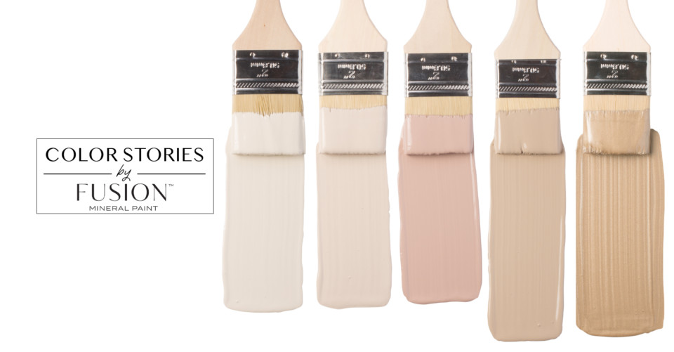
CHAMPLAIN
Hands down our most popular neutral warm and cool white that carries a lovely depth. While it is a warm shade, it doesn’t always pull the yellow that infuses it. If anything, you will find it more off-white with a grey undertone. A truly classic colour that adds a relaxed feel to any space.
CATHEDRAL TAUPE
Offering the slightest hint of a soft pink undertone, this neutral taupe goes with virtually anything! It is in many ways a classic yet trendy colour and definitely not the boring taupe of yesteryear. It is very much one of our more underrated colours but such a perfect neutral to complement any colour in the Fusion line.
DAMASK
This version of Damask is a newer addition to the Fusion line, based on the Damask pattern of wallpaper commonly seen throughout the gothic design. It is a dusty vintage rose colour, that we affectionately see as the Parisian, mysterious older sibling of our Millennial Pink, English Rose (discontinued). Damask can appear as a very pink rose to a more dusty mauve depending on the lighting and accompanying colours. It is a beautiful pink that embraces femininity but is still neutral enough to use in any situation.
ALGONQUIN
Our most popular deep taupe tends to change its colour tone depending on the lighting situation. It is an earthy tone, a deep taupe used paired with various colours to add intensity to any piece. Alternatively, Algonquin can be used as a light brown to anchor a room in natural and soft tones.
VINTAGE GOLD
This colour was inspired by Jamie Lundstrom from So Much Better With Age and her absolutely stunning DIY projects and love of French Vintage decor. If you crave an aged look that transcends time, this is the Fusion metallic paint for you. We’re so happy to celebrate Jamie’s book “French Vintage Decor: Easy and Elegant DIY Projects for Any Home“. Vintage Gold Metallic is a perfect brown-gold to give the sprinkle of rustic charm to any piece.
Relax and unwind this month with May’s Color Story from Fusion Mineral Paint! And if you use this colour palette in your decor, please share it with us in our Facebook Group Paint it Beautiful and tag us on social media using #FusionMineralPaint and #PaintItBeautiful.
