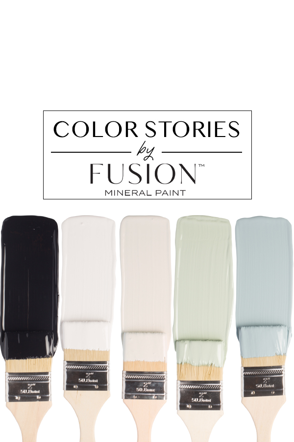
June’s Color Story from Fusion Mineral Paint is all about wanting to hit that alarm clock one more time and revel in the coziness of one’s bedroom. This time of year is a time when we enter a different phase of our lives – summer! And summer means lazy days, an emphasis on relaxing and with that in a peculiar yet serendipitous way, comes a whole new kind of energy. A chill one. From welcoming the end of the school year to having our windows open all the time and letting in that warm breeze we have so missed, the laid-back vibe is a welcome change that we do not take for granted. Savour every moment of this season as it is far too short where we are.
June’s Color Story from Fusion Mineral Paint
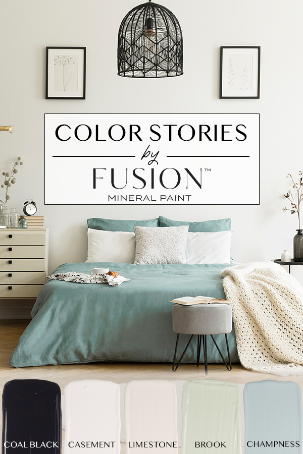
We start off June’s Color Story palette in a room that has a modern flare with an an eye catching blue that lends itself to Mid Century Modern decor, but can also be seen in at a seaside beach cottage. The punch of Coal Black throughout the space is just the right amount of dark for that subtle accent color. Casement is seen on the pillows and decor pieces on the tables. Limestone, a color that that lends itself as the perfect companion colors the blue bedding and can be seen on the rug and pillows.
Brook make its appearance in a subtle way as it tends to change color with the lighting. Sometimes it appears more green like the vase on the table and or perhaps a custom color mix with Limestone and a touch of Brook for the dresser. Or perhaps that is a combination Brook and Champness in the bedding. Texture in this room is everything. June’s color palette may seem quite sharp and crisp when it stands alone, yet this room is anything but rigid. We wanted to show how you can take colors that feel bold and masculine when put together on paper, but when used in a space can actually have a softer edge to them.
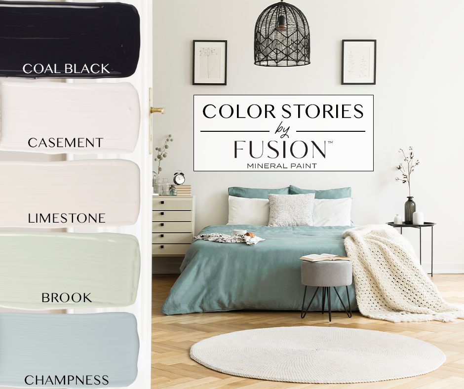
Let’s explore our June Color Story Colors!
COAL BLACK – everyone’s favorite, a true jet black that we see used on projects, time and time again. Whether it’s a picture frame, door handle or table, Coal Black is timeless and elevates any piece it’s used on. One of our best selling paint colors!
CASEMENT – We know white paint colors can be tricky but if you want a perfect neutral white, you’ll want Casement. A little less bright than our Picket Fence, it is definitely more on the cooler side of white paint colors. Which is why it pairs so well with crisp greens and blues.
LIMESTONE – named after the natural rock itself, it personifies that color that only Mother Nature could create with such beauty. When you see it on a dresser or cabinet you realize it’s subtle, almost buttercream, without too much yellow. It helps blues in your room become the center of attention.
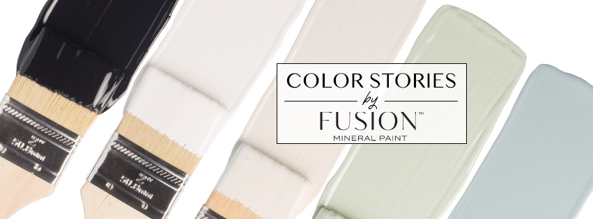
BROOK – This watery blue-green is a huge customer favorite! Whether it’s on a small craft with an antique vibe or a huge planter, this is that color that everyone asks “What’s it called?”. We have yet to see a project that is not loved by all when finished in Brook.
CHAMPNESS – This is the adult equivalent of a baby blue. It’s much more sophisticated than its counterpart and adds a touch of elegance to any project. It’s something we could easily see on kitchen cupboards in both a farmhouse with antique glaze and a modern kitchen. Mix it with Limestone for a warmer blue! Fun fact: Champness was named for Jennylyn’s grandmother (it’s Grandma’s maiden name!)
When you try out June’s Color Story, we would love to see your project! Don’t be shy and tag us in your work on social media using:
#FusionMineralPaint
#PaintItBeautiful
…and in our Facebook group Paint it Beautiful!
