

Neutrals are the foundation of every timeless space. They create calm, add warmth, and allow other elements to shine—or take center stage themselves. Fusion’s new Alchemy paint line reimagines neutrals with depth, complexity, and a soulful connection to the natural world. Meet the Alchemy Neutrals: six shades designed to evoke warmth, sophistication, and grounded beauty. These aren’t your standard off-whites and greys. Each one carries a unique undertone and mood, bringing character and subtle elegance to any surface they touch.
Let’s explore the full palette of Alchemy Neutrals:
Birch
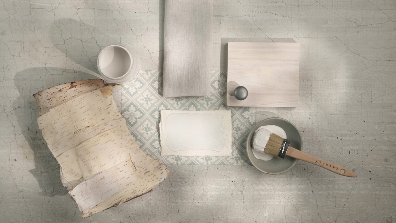
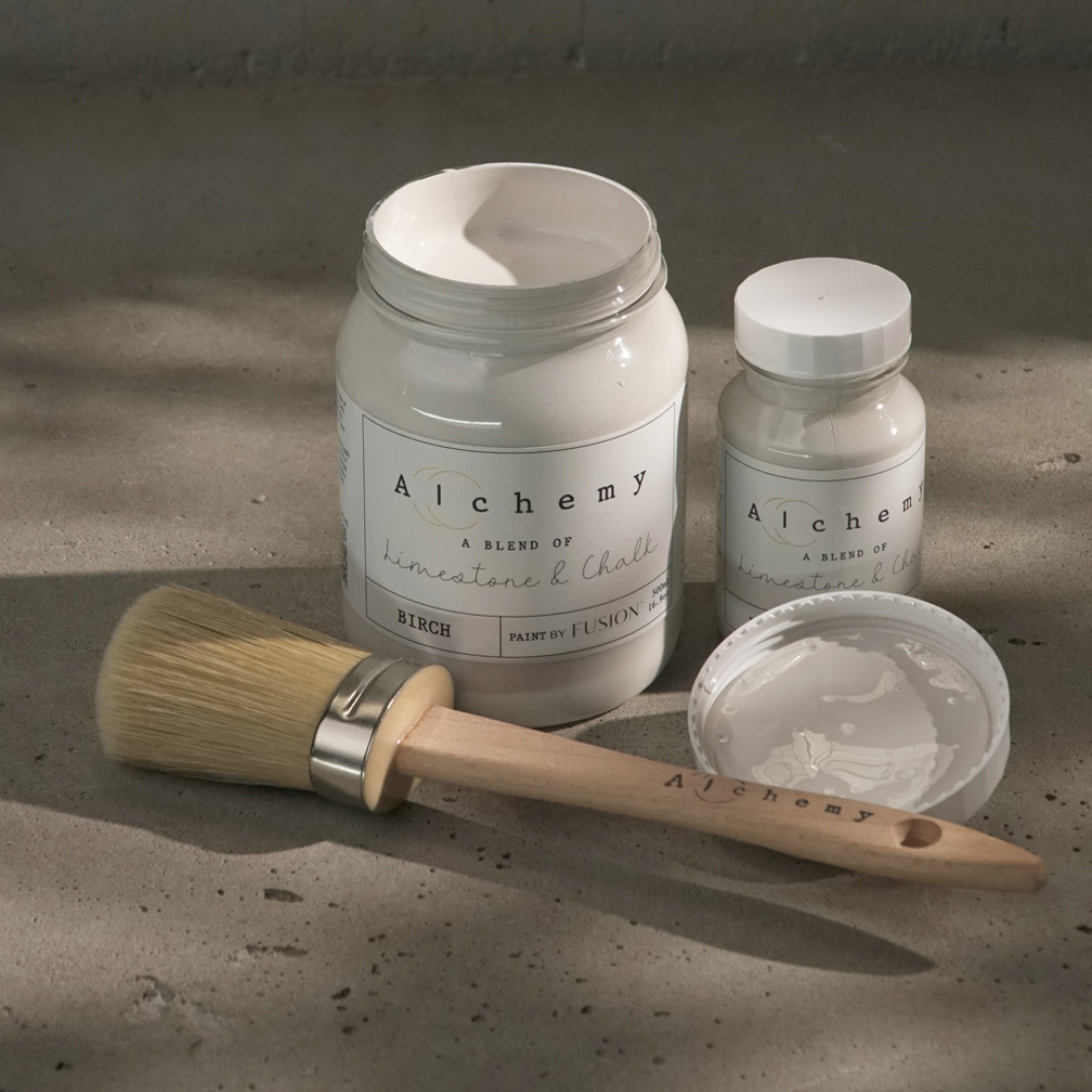
Birch is the whisper of nature in colour form. This earthy off-white feels soft, inviting, and effortlessly tranquil. With subtle undertones shifting gently in the light, it makes a perfect backdrop for serene, nature-inspired interiors.
Mood: Airy, peaceful, and grounding
Style Tip: Use Birch throughout open-plan spaces or as a base for layering bolder accents. It pairs beautifully with raw wood, botanical prints, and soft textiles.
White Oak

Weathered and warm, White Oak balances soft yellow and grey undertones for a look that feels timeless and worn-in—in the best way. This antique off-white has the charm of something aged gracefully yet still fresh and versatile.
Mood: Subtle, sophisticated, and lived-in
Style Tip: Try White Oak on cabinetry, trim, or vintage furniture for a soft, aged finish. It works especially well with brass accents and linen textures.
Alabaster
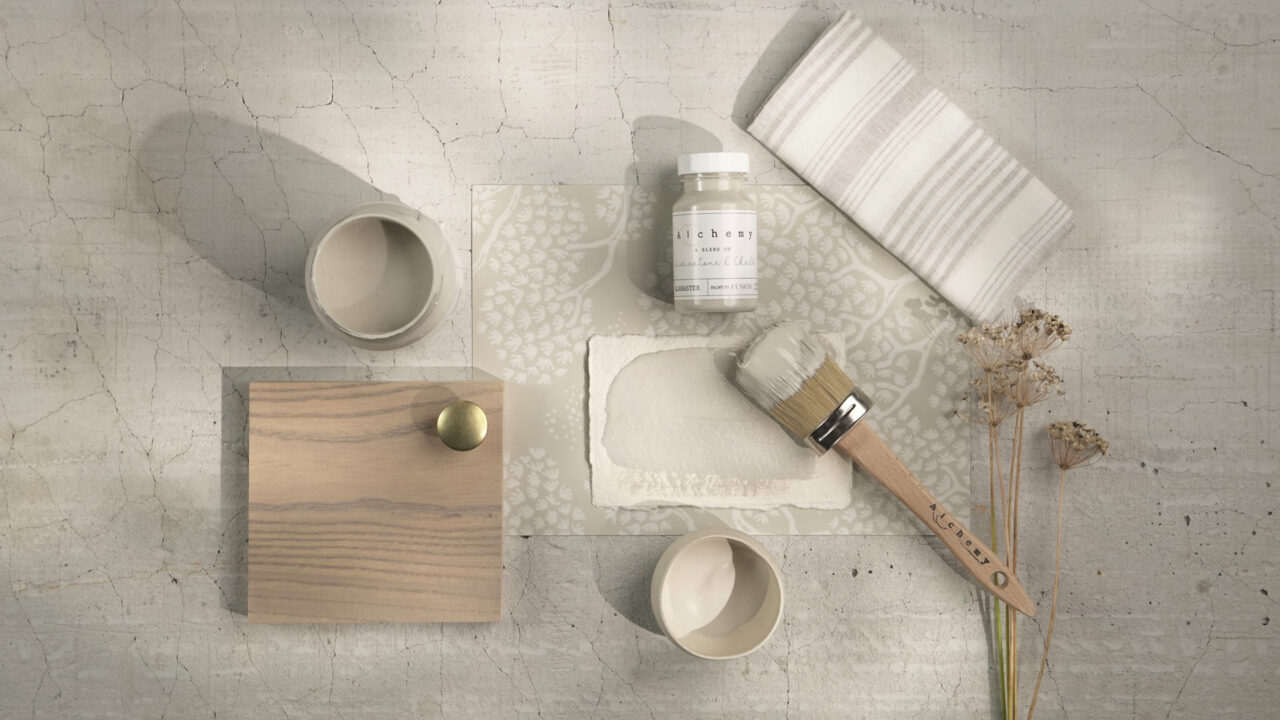

Elegant in its simplicity, Alabaster is a serene taupe that calms the senses and elevates the space. With its understated warmth, this shade blends seamlessly into any palette while offering just enough presence to stand on its own.
Mood: Calm, classic, and refined
Style Tip: Use Alabaster in bedrooms or offices where a sense of peace is essential. Pair it with soft greens, creams, or light woods for a fresh yet timeless look.
Sandstone
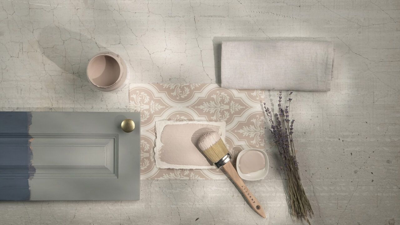
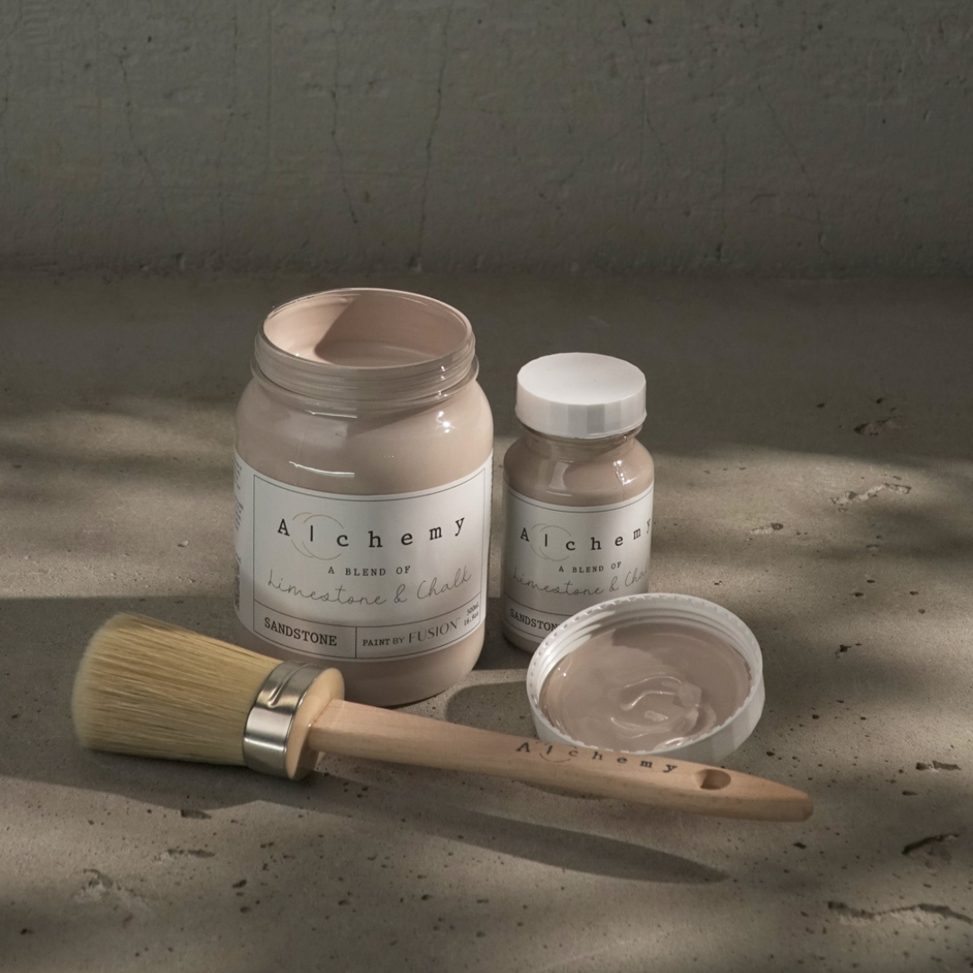
Soft and sun-warmed, Sandstone leads with pink undertones for a subtle yet inviting feel. Inspired by desert hues and rosy stone, this warm taupe adds comfort and a touch of elegance to any room.
Mood: Cozy, feminine, and welcoming
Style Tip: Pair Sandstone with terracotta accents or blush-toned decor for a warm, monochromatic look that feels modern and earthy.
Clay
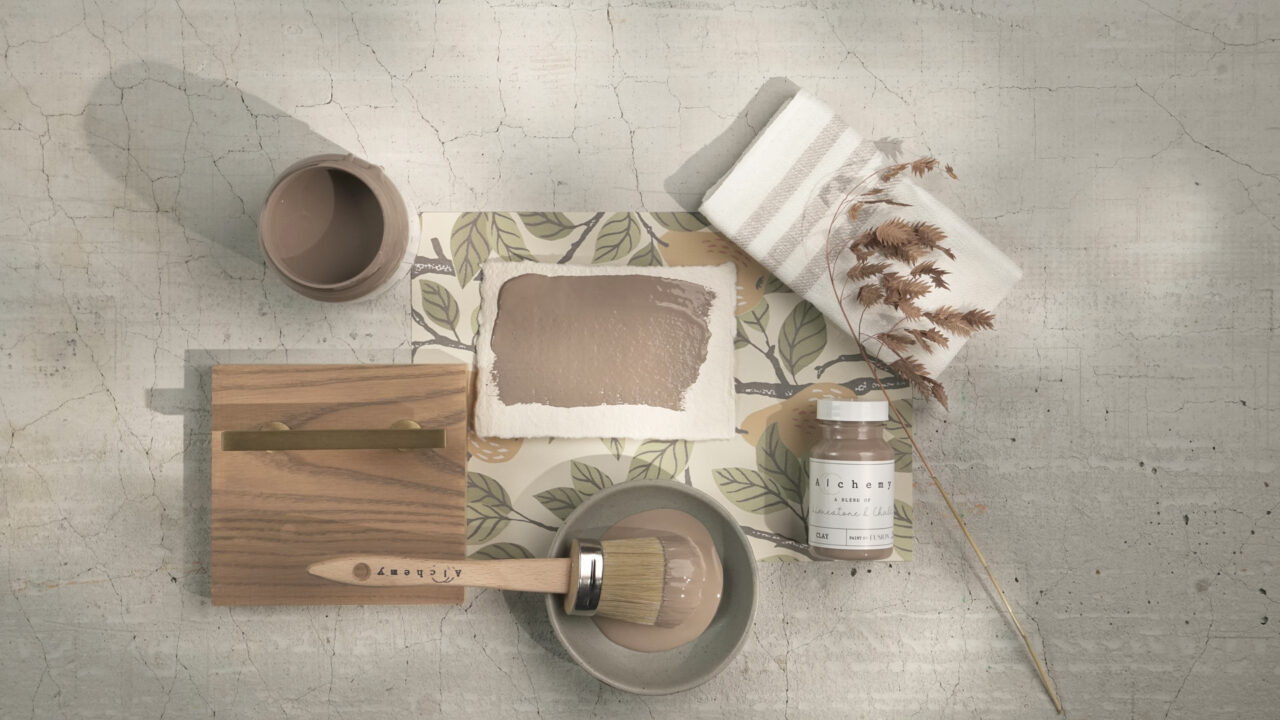
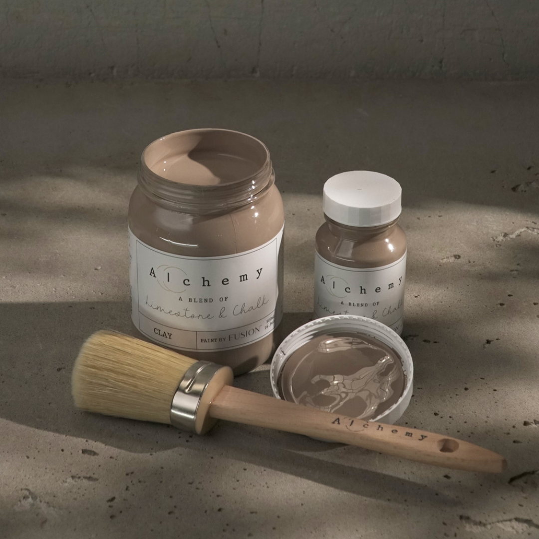
Deep, grounded, and rich with grey undertones, Clay brings natural depth to the neutral family. Reminiscent of fertile soil and earthen pigments, it adds structure and sophistication without overpowering.
Mood: Strong, grounded, and bold
Style Tip: Use Clay in high-contrast palettes or to anchor a space—think kitchen islands, feature walls, or deep-toned furniture. It complements stone, black metals, and wood-grain textures beautifully.
Onyx
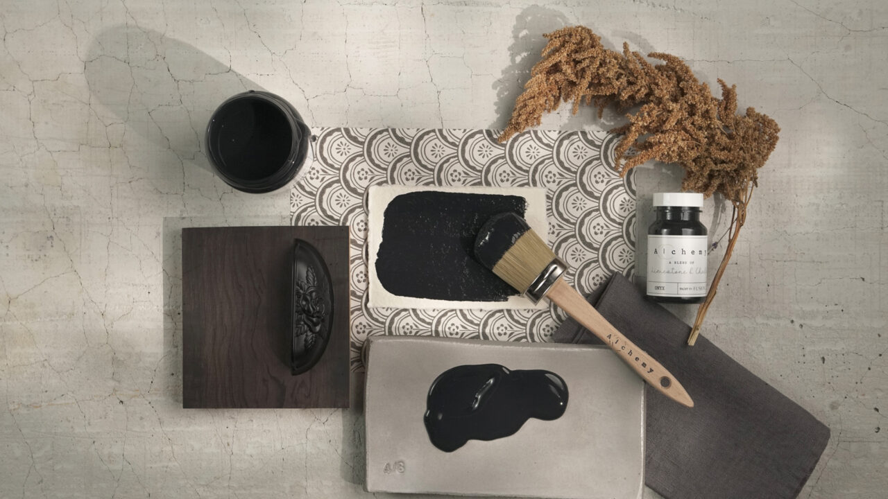

True and unapologetically neutral, Onyx is the black that plays well with everything. It’s perfectly balanced—neither cool nor warm—making it ideal for adding contrast, depth, or definition.
Mood: Bold, dramatic, and versatile
Style Tip: Use Onyx for high-impact moments: interior doors, hardware, stenciling, or modern accents. It brings a clean edge to rustic or minimalist interiors alike.
Why Choose Alchemy Neutrals?
Fusion’s Alchemy line redefines what paint can do for a space. These neutrals aren’t just safe—they’re sophisticated, layered, and emotionally resonant. With Fusion’s trusted formula, they apply effortlessly and hold up beautifully, giving you finishes that feel both modern and timeless.
The Alchemy Neutrals offer more than background colour—they create harmony, highlight texture, and ground your design in nature’s quiet beauty.
Which Alchemy Neutral speaks to you—Birch, White Oak, Alabaster, Sandstone, Clay, or Onyx?
Tag your creations with @FusionMineralPaint and #AlchemyNeutrals to show us how you bring these soft, earthy tones into your home.