Get Inspired with Fusion™ Mineral Paint’s September Colour Story
Fusion Mineral Paint’s Colour Stories create stylish interiors with ease. Every month, we create a beautiful new colour scheme showcasing our paints, which enables the crafting of stunning interior design schemes. You’ll find no shortage of inspiration in our September Colour Story!
September’s Colour Story Unveils a Serene Loft Bedroom Retreat
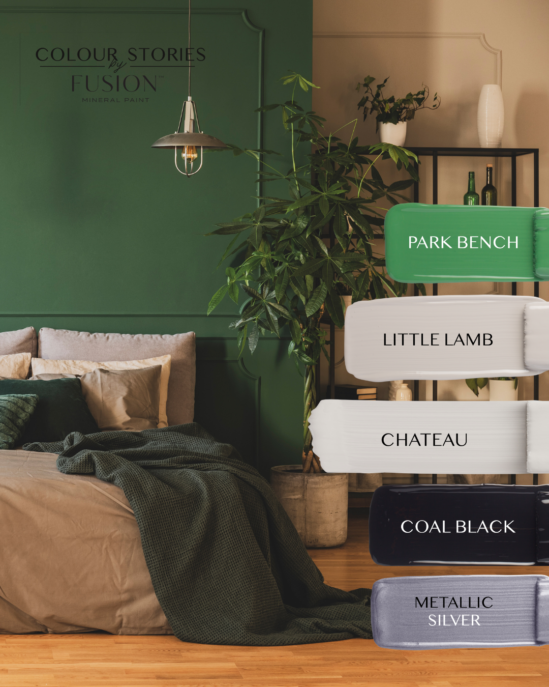
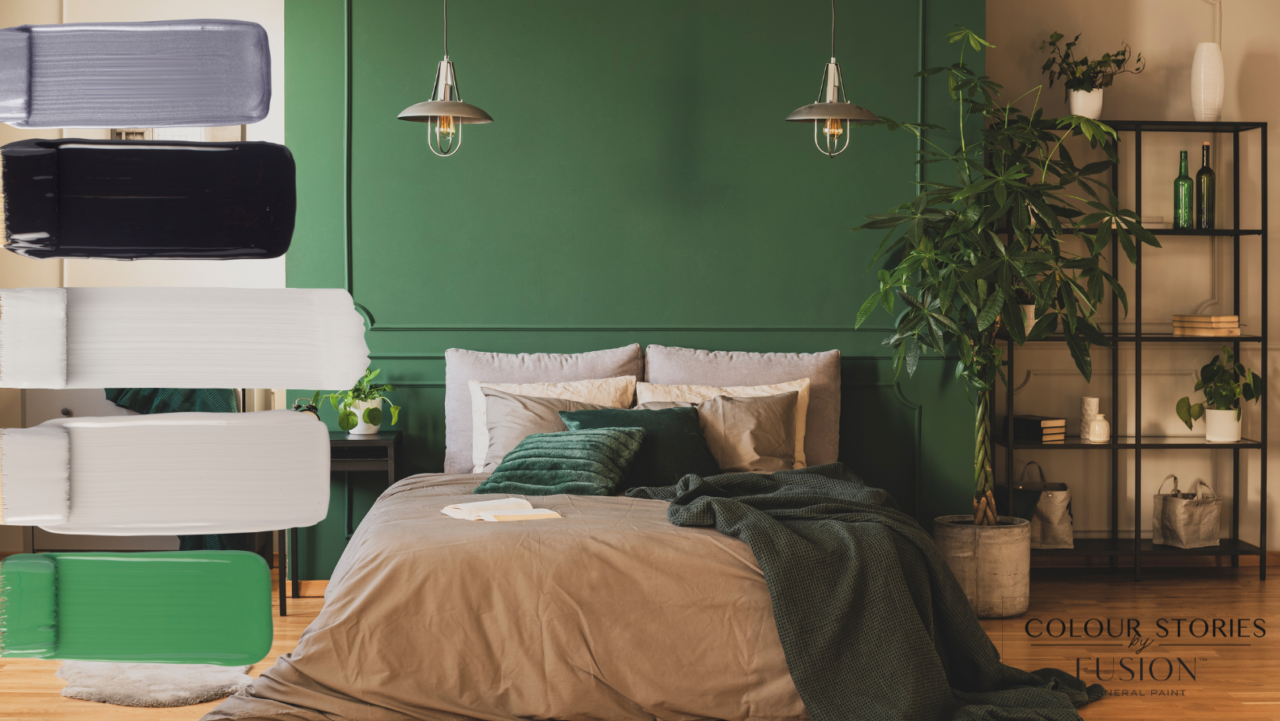
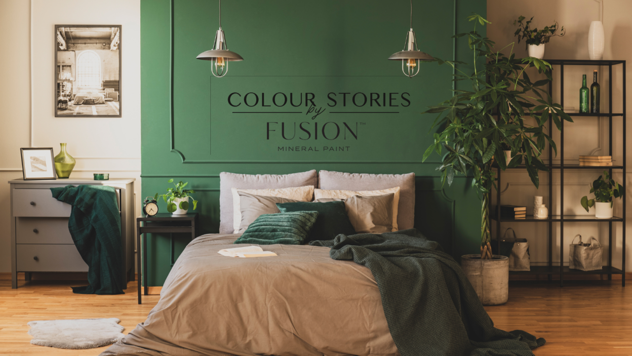
This Serene Loft Bedroom Retreat designed with September’s Colour Palette of green, black, off-whites, and metallic silver, creates a harmonious and tranquil space that combines nature-inspired elements with modern sophistication.
September’s Colours

Park Bench: A deep and deliberate green inspired by the iconic benches found at the Jardin des Tuileries in Paris.
Little Lamb: This wooly grey is an elegant neutral, making it the perfect complementary shade.
Chateau: A grounding neutral inspired by enchanting castle walls. This shade reflects light beautifully and creates an instant feeling of cozy sophistication.
Coal Black: Our absolute deepest, darkest, boldest black. Coal Black is intense and classic.
Metallic Silver: Our Silver has a never-ending shimmer to inspire glamour and modern elegance. This non-tarnishing metallic is perfect to create highlights or produce a statement piece.

Putting September’s Colour Story into Your Bedroom
- Park Bench: The green colour represents nature, renewal, and growth. In a serene bedroom retreat, green can be used as a foundational colour, perhaps on the walls or in the bedding. It brings a sense of tranquillity and freshness, helping to create a connection with the outdoors.
- Coal Black: Black serves as a bold and grounding element in the colour palette. When used thoughtfully, it adds depth and contrast to the space. Black also brings a sense of elegance and drama, balancing the overall colour scheme and preventing it from feeling overly light.
- Chateau & Little Lamb: Neutrals, such as creamy ivory or grey, serve as the neutral base that ties the colour palette together. These subtle and warm tones create a soft backdrop that enhances the serene atmosphere.
- Metallic Silver: Silver accents, such as metallic finishes on decor, light fixtures, or accessories, introduce a touch of sophistication and glamour to the retreat. Silver reflects light, contributing to a sense of airiness and brightness in the room. These accents can be strategically placed to catch and reflect light, adding a subtle shimmer that complements the calming ambiance.
A colour story palette can help to eliminate the overwhelming feeling of having too many colour options. When faced with a wide range of colours, it can be difficult to decide which ones will work well together. We know we haven’t made choosing a colour easy with our beautiful collection. #sorrynotsorry. We understand the delightful struggle that comes with selecting the perfect Fusion™ Mineral Paint shade. With our Colour Stories boasting an array of stunning colours, the decision-making journey is an artful adventure in itself!
Happy Painting!
Check Out The Previous 2023 Colour Stories
January Colour Story
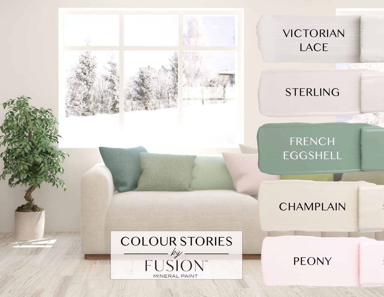
January’s colour story features a palette of soft and elegant hues that are perfect for adding a touch of sophistication to any room. The Sterling, Champlain, Victorian Lace, French Eggshell, and Peony colours in this collection work well together as accents or the main feature of a space, creating a cohesive and refined look. These colours are versatile and can be used to create a range of moods and atmospheres, from calm and peaceful to romantic and welcoming.
February Colour Story
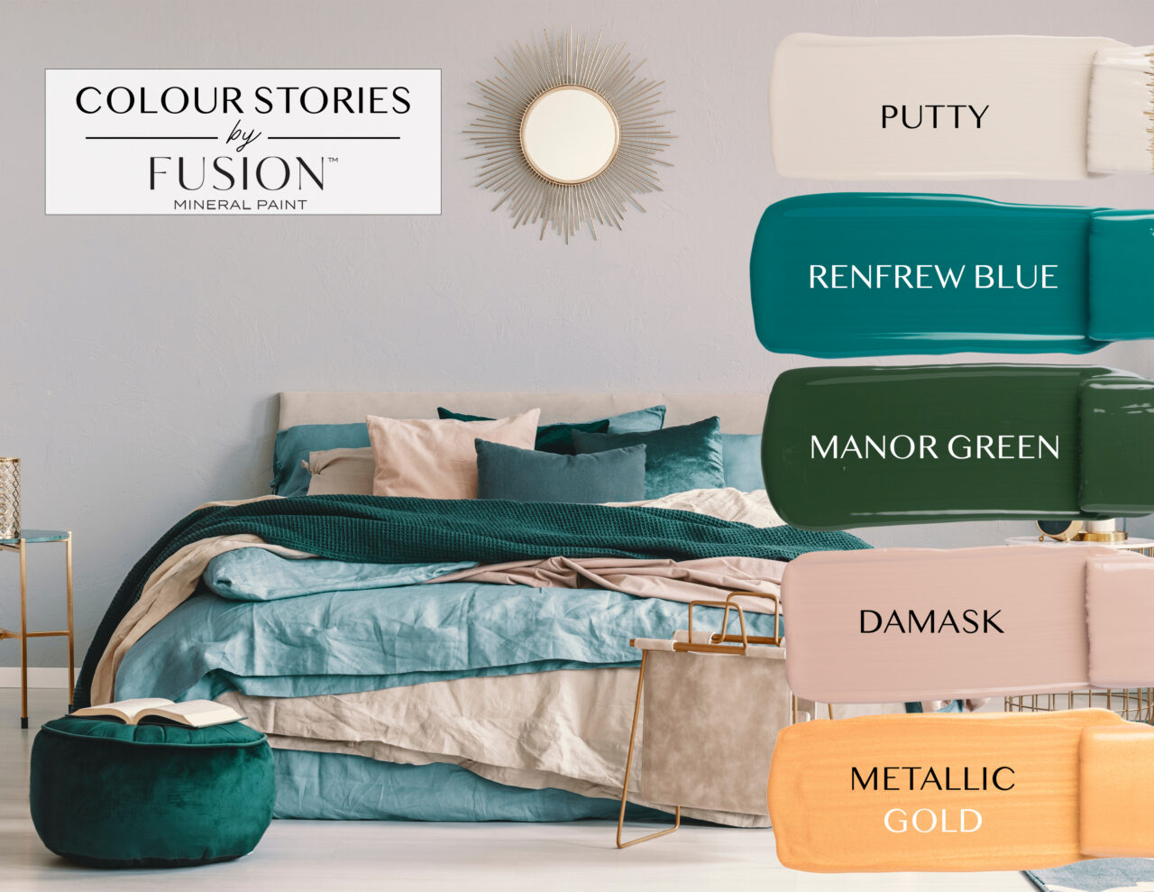
This lived-in look bedroom with soft greens, blues, touches of gold, and warm neutrals, is perfect to show off this February’s Colour Story. This palette creates an inviting sense of tranquillity that is ideal for relaxing bedrooms. Bring in extra comfort by adding layers of ruffled sheets or textured throws to complete the look! Just choose a colour from the story and it will all look cohesive and thought out.
March Colour Story
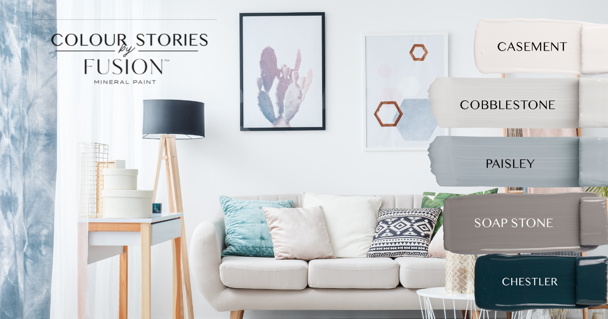
This transitional design living room is perfect to show off this month’s Colour Story. In transitional design, it’s important to let the furniture and the textiles do the talking using throw pillows, and blankets to accessorize.
April Colour Story
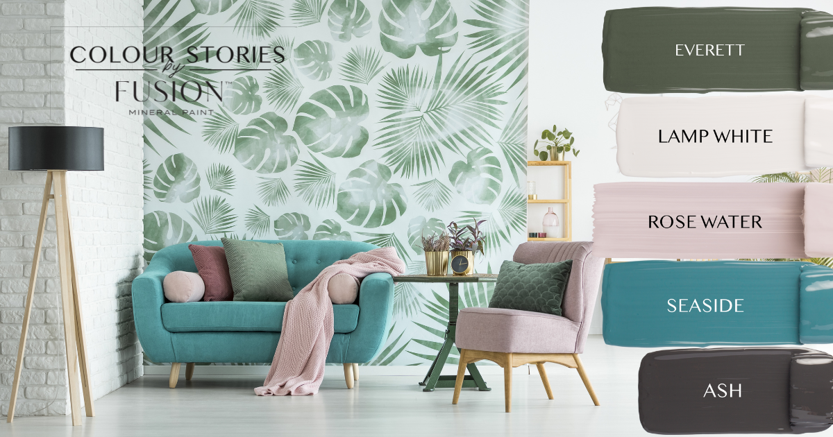
This month’s colour story creates a vibrant, tropical-style room with ease. The tropical design style is a decor scheme that embodies the warm and vibrant themes of the tropics. This style is characterized by bright, bold colours such as turquoise, green and pink, often in floral or botanical patterns.
May Colour Story
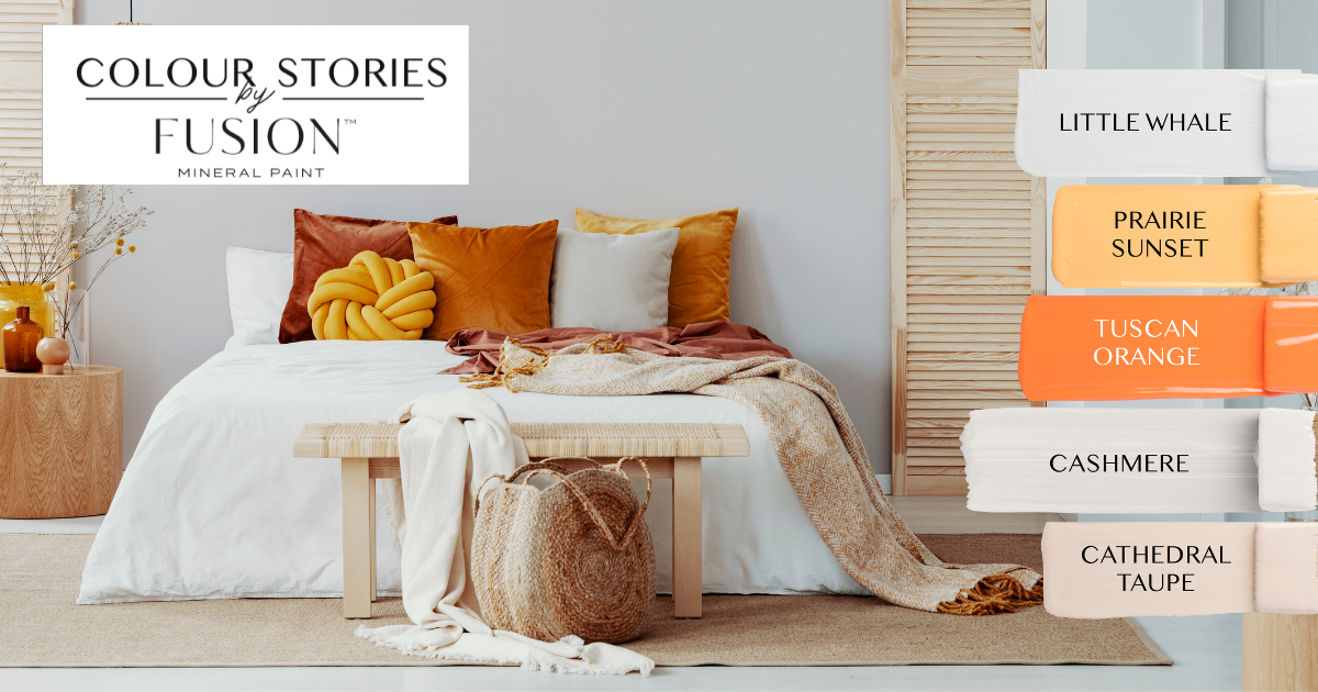
Retro-Modern Design: Typically incorporates bold, warm colours like mustard yellow, burnt orange, and deep reds.
Scandinavian Design: In recent years, there has been a trend toward incorporating more colour into the Scandinavian style. To achieve a bold and modern look, designers have been incorporating bold tones like yellows and oranges.
June Colour Story
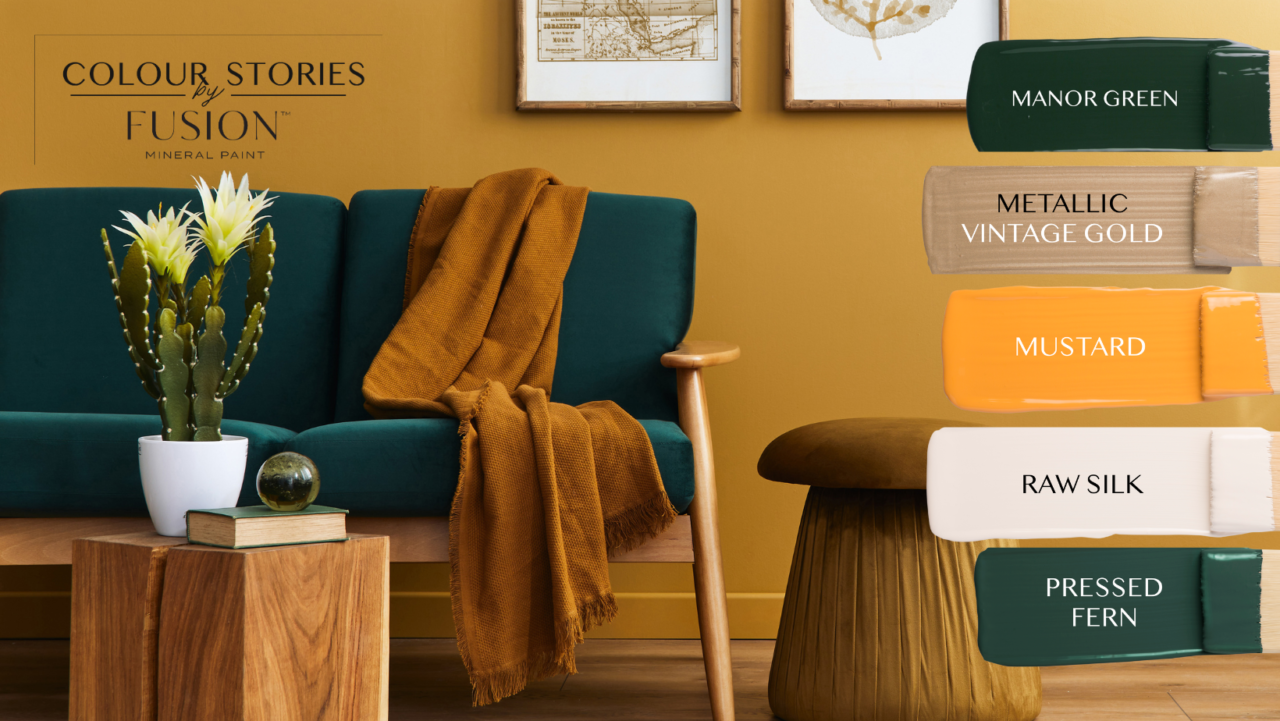
This living room effortlessly combines the timeless appeal of wooden accents with the refreshing modernity of a deep green couch, complemented by pops of yellow and the natural beauty of a cactus plant. It’s a haven of comfort and style, inviting you to relax, recharge, and enjoy moments of serenity in its embrace.
July Colour Story
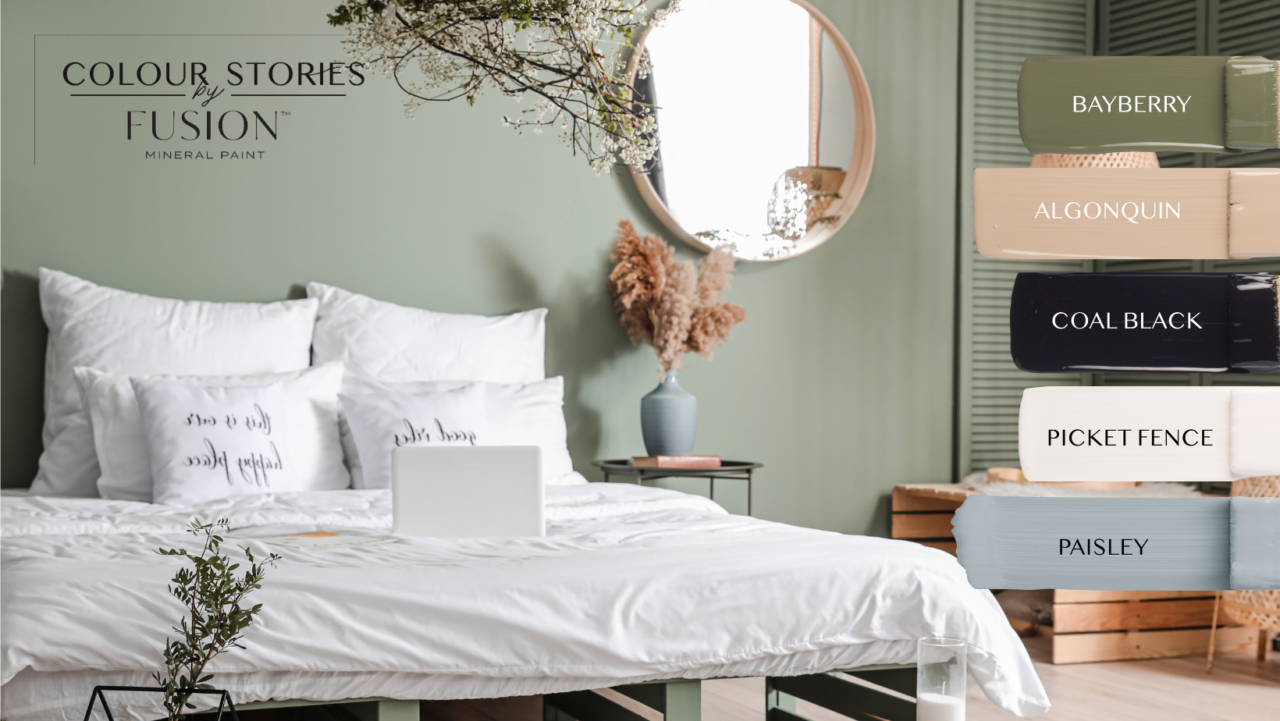
Welcome to your serene sanctuary featuring July’s Colour Story, a bedroom designed to embrace tranquillity and relaxation. A captivating blend of neutral tones, wooden accents, and subtle embellishments adorns the space, creating an atmosphere of calmness and harmony.


