Get Inspired with Fusion™ Mineral Paint’s May Colour Story
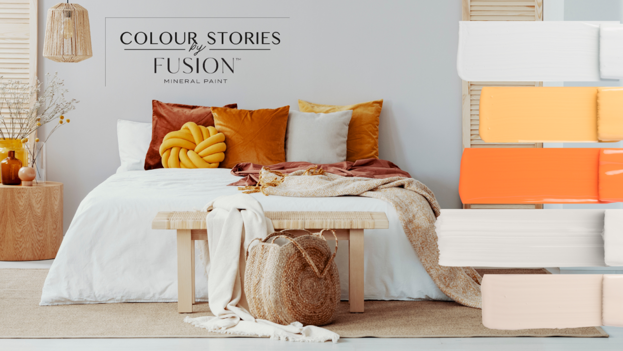
Fusion Mineral Paint’s Colour Stories create stylish interiors with ease. Each month, we create a beautiful new colour scheme featuring our paints that can be used to craft stunning interior design schemes. You’ll find no shortage of inspiration in our May Colour Story!
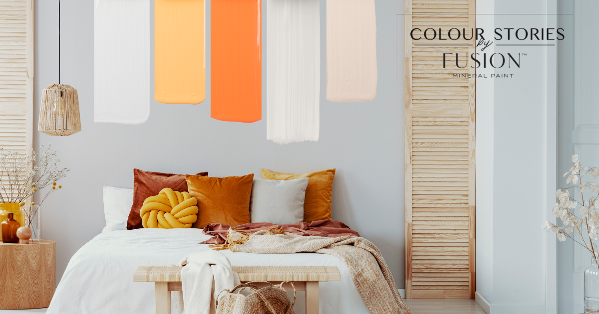
This month’s story would work great in a wide range of design styles.
Retro-Modern Design: Typically incorporates bold, warm colours like mustard yellow, burnt orange, and deep reds. The materials used in this style also tend to be natural, such as leather, wood, and cork.
Scandinavian Design: Known for its clean, minimalist aesthetic that incorporates a lot of white and neutral colours. However, in recent years, there has been a trend toward incorporating more colour into the Scandinavian style. To achieve a bold and modern look, designers have been incorporating bold tones like yellows and oranges. These colours provide a beautiful addition to the typically neutral Scandinavian elements.
May Colour Story Colours
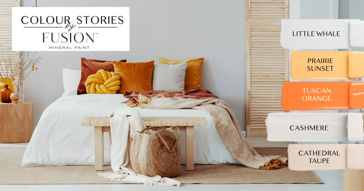
Little Whale: A calming, grey-blue that adds tranquillity to any space.
Prairie Sunset: Optimistic and warm, this sunny yellow is vibrant yet flexible enough that it complements just about any other hue.
Tuscan Orange: A rustic orange-red, inspired by the uniquely coloured brick found in the beautiful Italian landscape.
Cashmere: Soft and elegant, this shade offers a slight cream undertone.
Cathedral Taupe: A sophisticated taupe inspired by the architectural beauty of its namesake.
This goes-with-anything shade delights with a soft pink undertone.
Why Choose a Colour Story?
A colour story can be incredibly helpful when designing a room because it provides a cohesive vision for the space you are designing. A colour story is a palette of colours that work together harmoniously and can be used throughout the room in different ways. By choosing a colour story, you establish a colour scheme for the room that will guide all of the design choices you make. That’s why Fusion Mineral Paint is happy to provide you with monthly colour stories, giving you lots of options to create your perfect space!
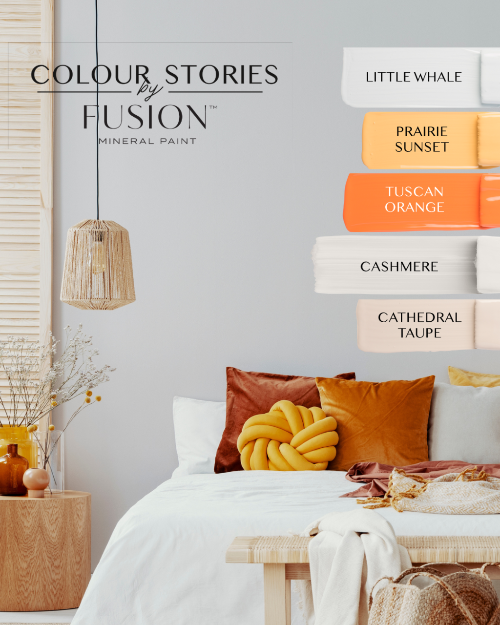
Additionally, a colour story palette can help to eliminate the overwhelming feeling of having too many colour options. When faced with a wide range of colours, it can be difficult to decide which ones will work well together and achieve the desired look. We know we haven’t made choosing a colour easy with our beautiful collection. #sorrynotsorry
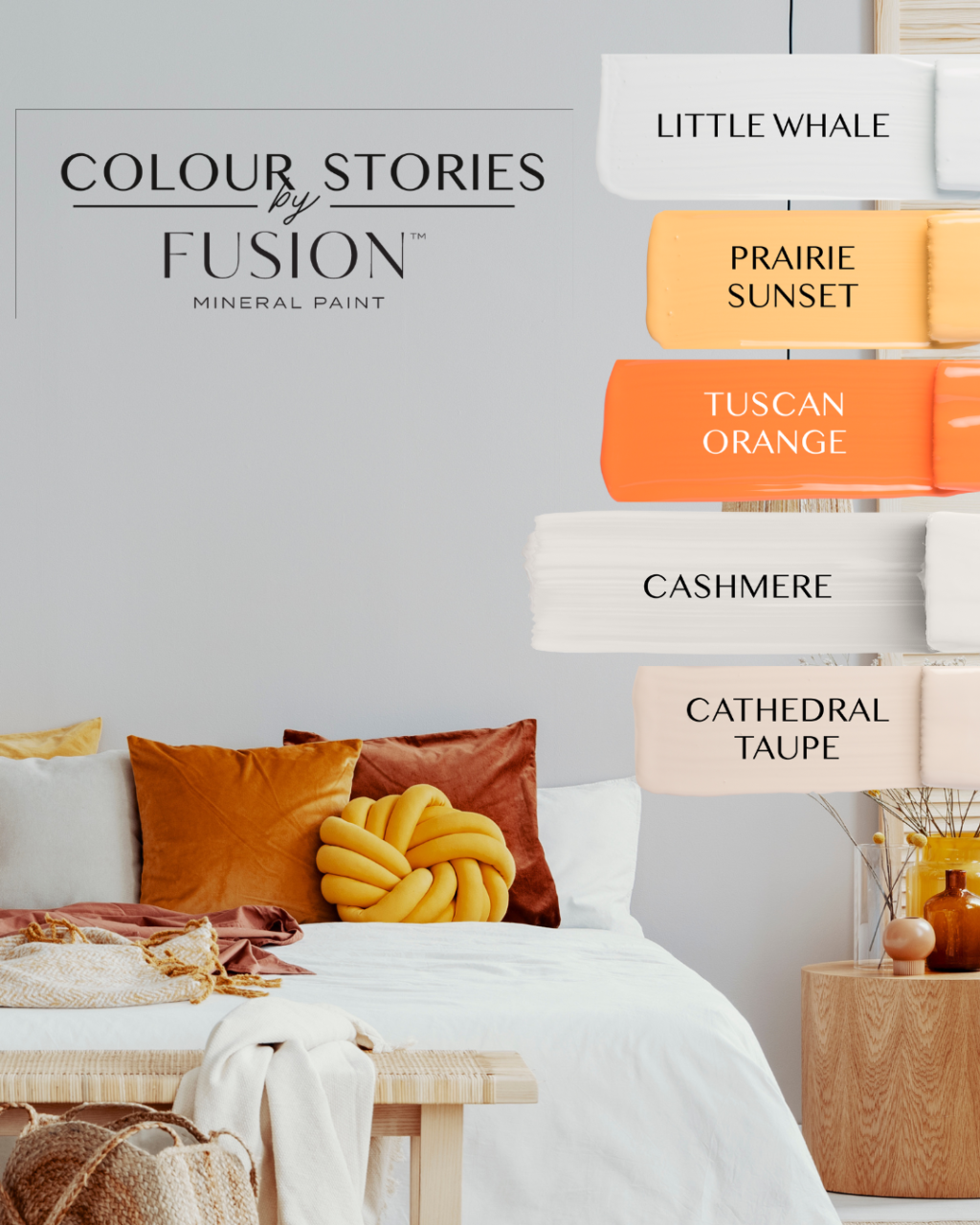
Choosing a story can also make adding personality and style to your space easier. We choose the colours in our Stories to work together and evoke a certain feeling or mood, so you can create a space that reflects your personal style and interests. What’s your story?
See our previous Colour Stories:
Check out our Design palettes and let the colours inspire you.


