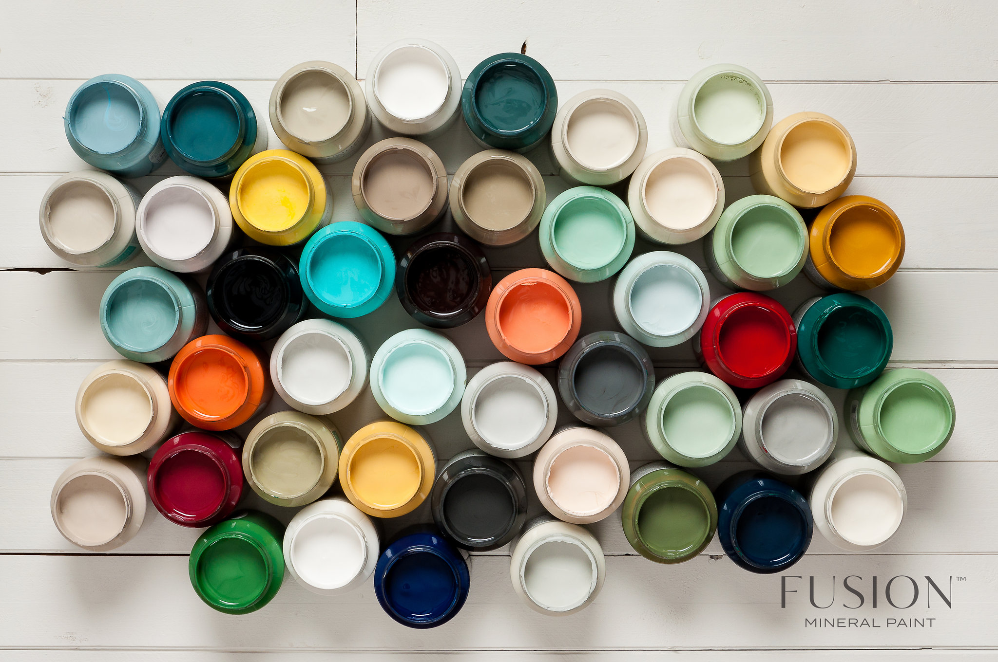
We have long been asked to produce a true-to-spec colour card since we ran out of our initial one with the 24 original Fusion colours on it!
Whilst many of our Fusion Merchants carry these lovely display blocks in their store, being able to take home a true-to-colour card is helpful!
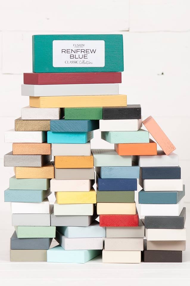
Our very first Original Colour Card!
It featured our beautiful Champness blue on the front! It was pretty basic, but it got the job done!
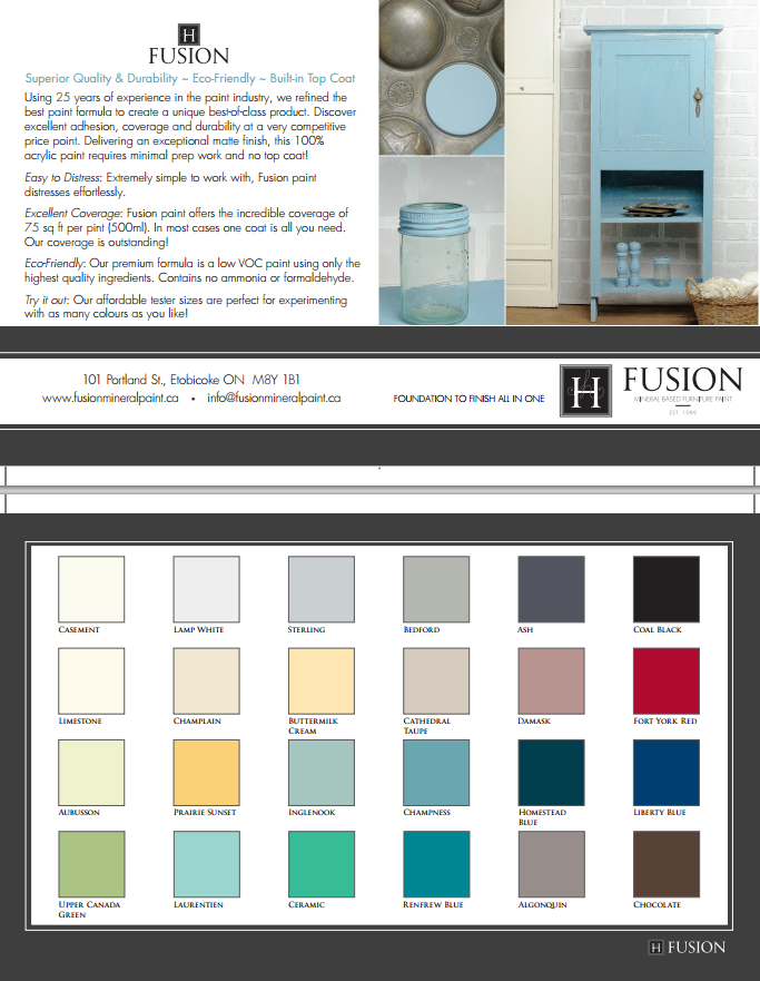
Currently, we have these printed ones, which do a pretty good job at giving you a good idea of the basic colour range, however print is never perfect unless you go with real paint!
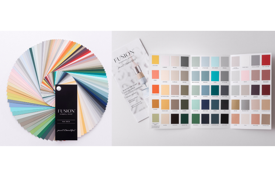
Our new one is going to give you a little more! Including tips on getting started with Fusion Mineral Paint, and a little bit about our company history! We used to hand paint each swatch and stick them on manually – all by hand! I love how technology has changed and the cost of print has come down!
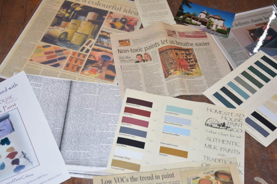
Before we launched our Fusion line, we had our Homestead House line with 32 colours. My parents actually had to re-mortgage our house to be able to afford to print 100,000 copies. Some of these are still floating around in existence – if you have one- cherish it! Printing true colour cards is serious business!
Now it’s time to choose a Cover Feature image!
This is super important to get right as it is the “First Look” for those new to Fusion Mineral Paint – it needs to be inspiring!
I know that isn’t difficult! But with so many beautiful and inspiring images, how do we choose?!
Please help us by commenting on which one is your favourite!
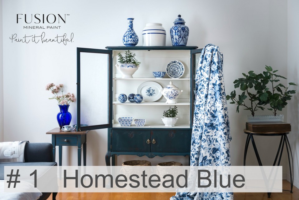
Although a little darker in this photo than usual, Homestead Blue is a true staple and named after our parent company Homestead House Paint Co.!
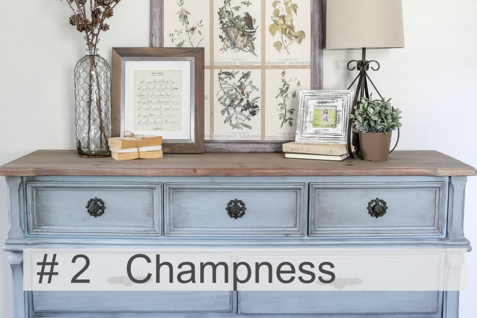
This piece had a coat of Black Wax on it making it look a much darker version of our beautiful Champness. This colour was named after my grandmother’s maiden name!
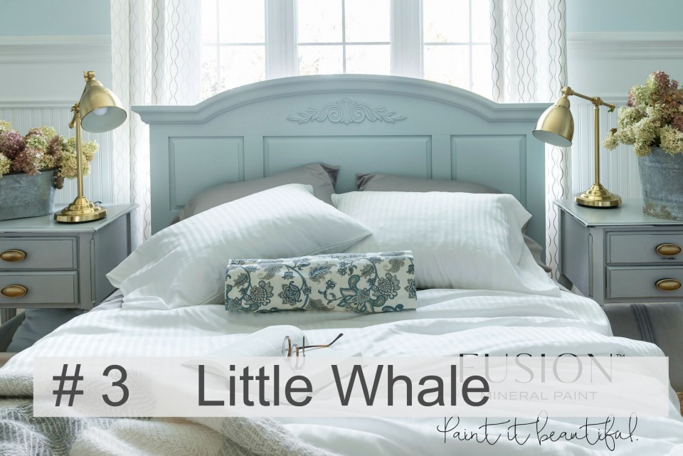
Little Whale is from the Tones for Tots collection, this soft subtle pastel blue.
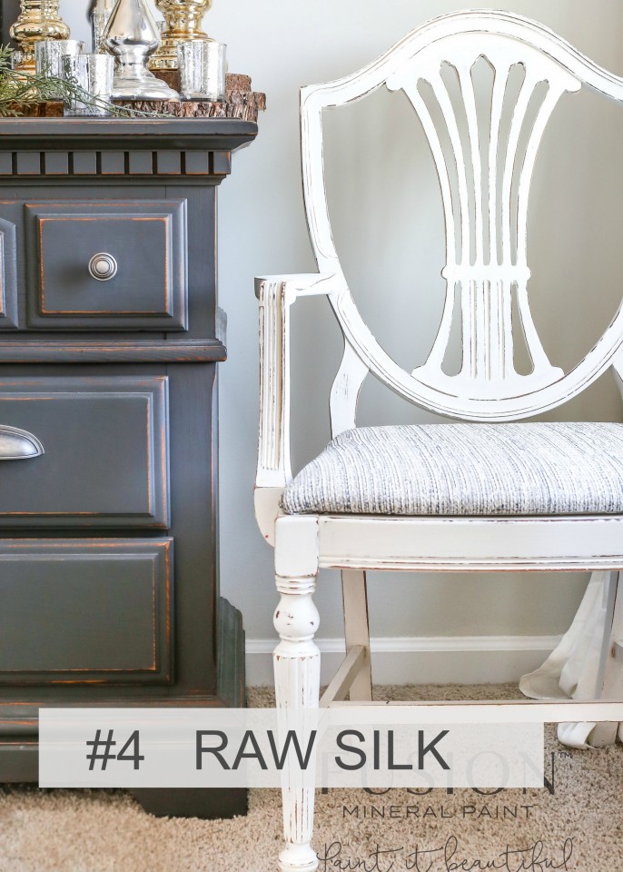
Raw Silk is the perfect off white neutral colour. It’s warm and cool tones match with virtually every colour. I just love this distressing.
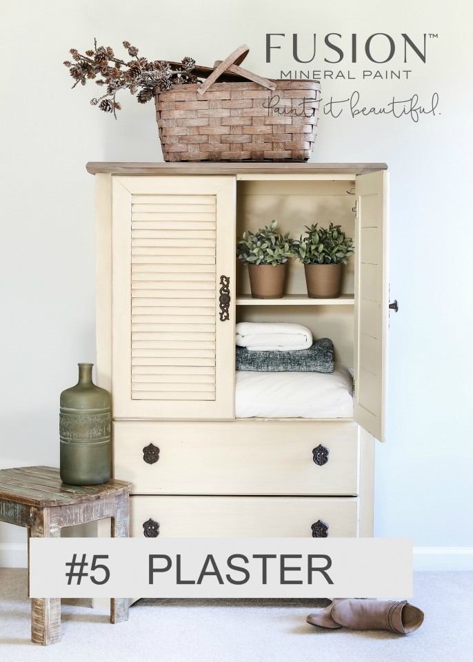
Plaster is a neutral soft off-white yellow undertone with a brown base, it’s the perfect French beige.
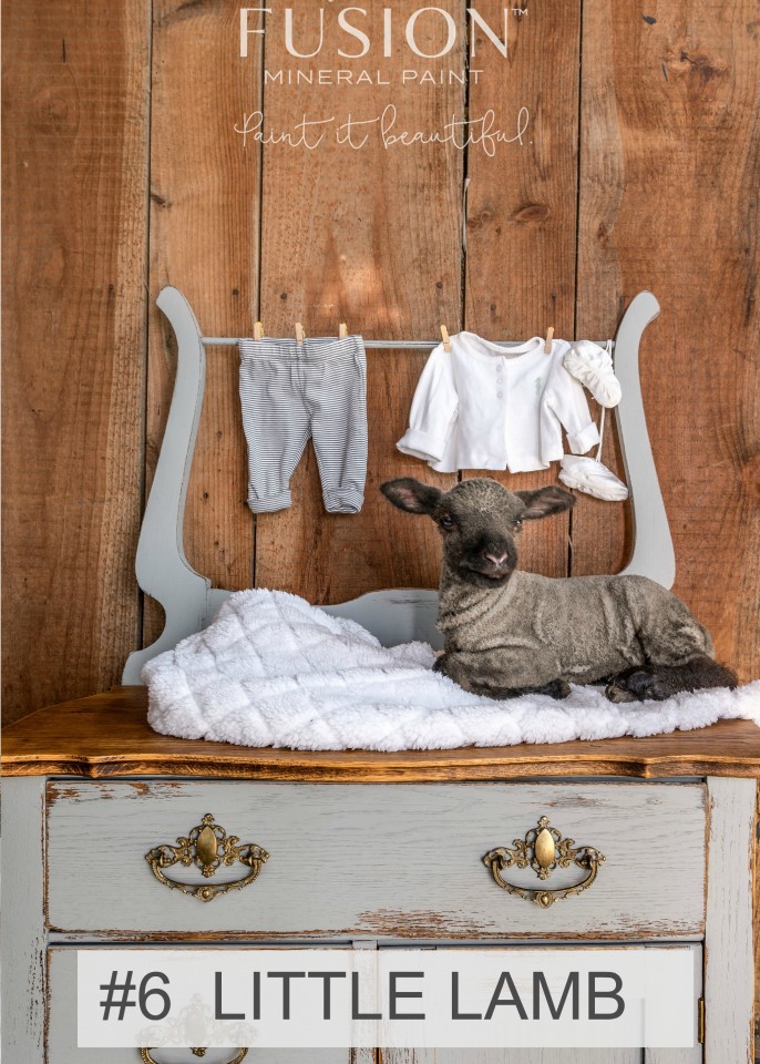
Little Lamb is the most perfect soft neutral gray colour, from our Tones for Tots collection.
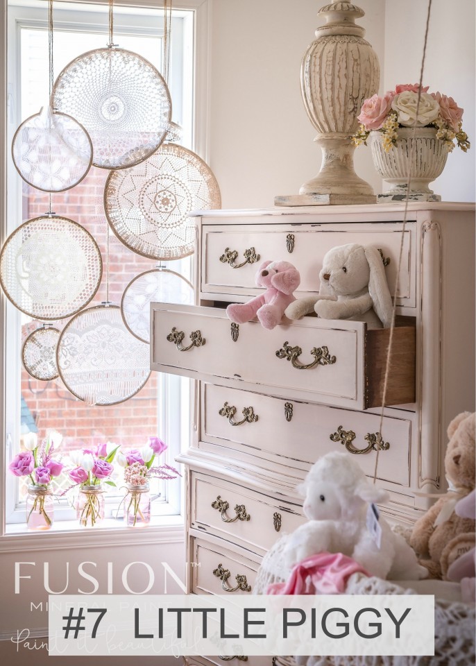
Little Piggy (discontinued) is a soft pale pink, excellent for adults too! From our Tones for Tots collection.
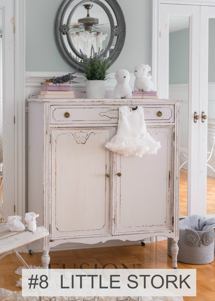
Little Stork (discontinued), part of our Tones for Tots Collection, is the softest most sophisticated pale lavender. It’s exceptionally subtle.
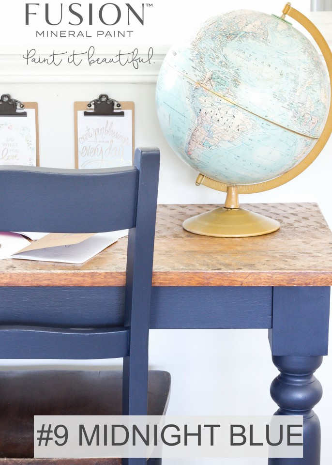
Midnight Blue is a classic deep rich blue. This sleek no distressed finish shows off its beautiful lustre.
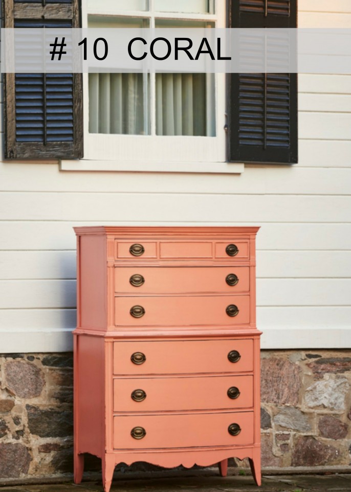
Coral is part of the Michael Penney Collection and is a beautiful bright coral!
Do you have a photo that you would like to submit for consideration? Post on our public Facebook Group Paint it Beautiful here and let us know!

I dream of offering a colour fan deck as well, and hope that is coming in the near future too!
“One step at a time Jen”, that’s what I have to keep telling myself!


My choice is number one, it shows how the old fashioned furniture can be painted and featured and how to make it the highlight in a modern, up to date setting.
I like 1 and 2 – hard to decide between those two!!
#5. You can see more of the paint on the piece of furniture and it shows the natural finish of the paint without wax or a lot of distressing.
#4. The classic combination of Raw Silk and Ash (?) Is always a hit
I think #5. I do like #2 and #3 as well. The reason I choose it is because it speaks more to inspiring people to transform their pieces with Fusion rather than showing off a particular colour. I work part time for a Fusion Retailer in Marmora ON and there are several large Fusion posters on display. One of them is #5 and by far more people comment on this poster than any other! Just offering my 2 cents worth ! ❤Fusion ! ????Kay, My Mother’s Dresser
#5 I just love the warmth of it. It made me think of home.
Plaster. I like the untouched perfect paint.
I like #4 because it has two colors in it and also shows some easy distressing. Communicates “doable” to me. I worked in a shop that started selling FMP and from my first project I was hooked! I’ve use milk paint, chalk paint and Fusion. Fusion made me feel like I could paint anything!
#6 Little Lamb or #4 Because it shows two of the colors (raw silk & ash)
#6 little lamb or #4 ash and raw silk, definitely more appreciated here in Europe
# 1 or # 7, but I’d consider putting a block of 4 images on the front of the card to show the versatile colours, which would no doubt catch someone’s eye walking by the card/brochure.
being a blue lover, #1 really catches my eye.
#2 Champness is gorgeous. That’s my pick!
#2 – Champness – so lovely, and shows the stained top nicely. Classic. However, a photo similar to #9 Midnight Blue prompted me to order my first samples (including it!)
So glad Martha!