
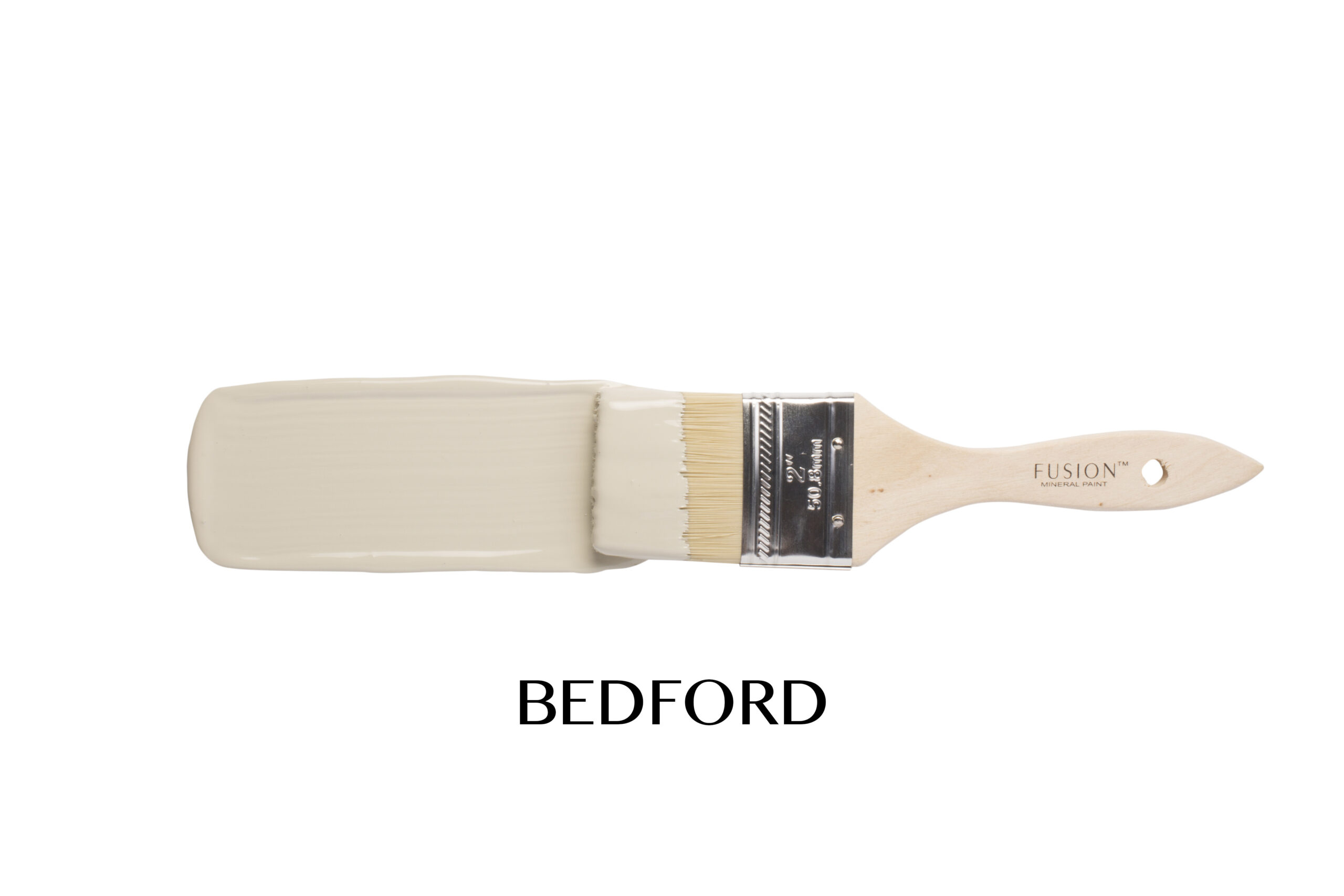
Bedford, this colour likes to keep people guessing. Is it green? Is it olive? Does it have a yellow undertone? Depending on the light, the room, and what you pair it with, Bedford can shift beautifully throughout the day. In some spaces it leans into a soft earthy green, while in others you suddenly notice those warm golden undertones creeping through.
That’s exactly what makes it so interesting. It has that lived-in, heritage feel without looking heavy or dark, and works just as beautifully on traditional furniture as it does on more modern pieces.
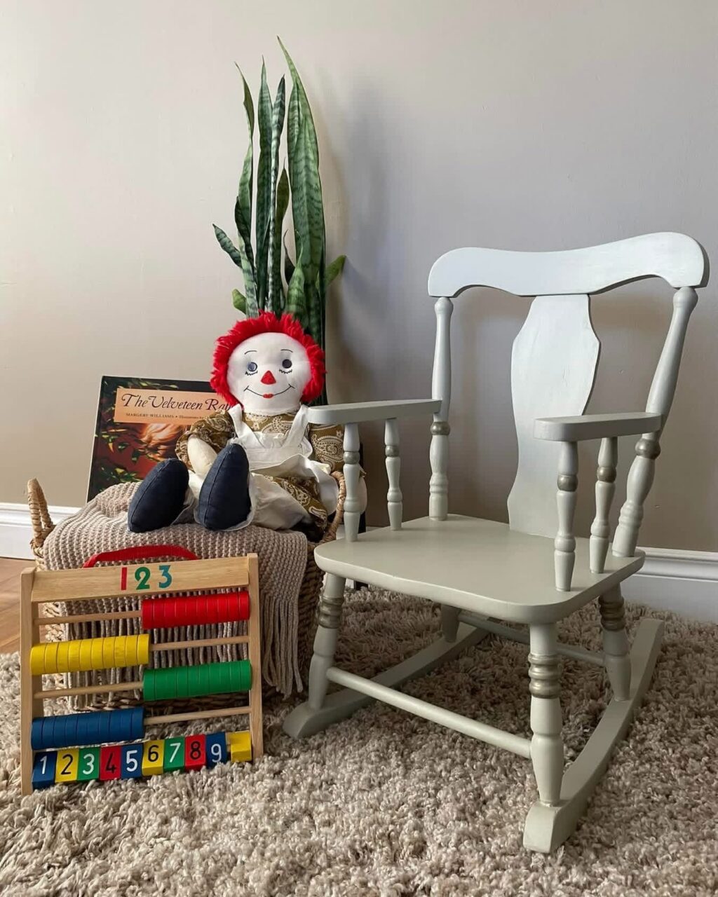
Susan Kilby Charles used Bedford on a fun child’s chair where the colour feels playful yet still beautifully vintage.
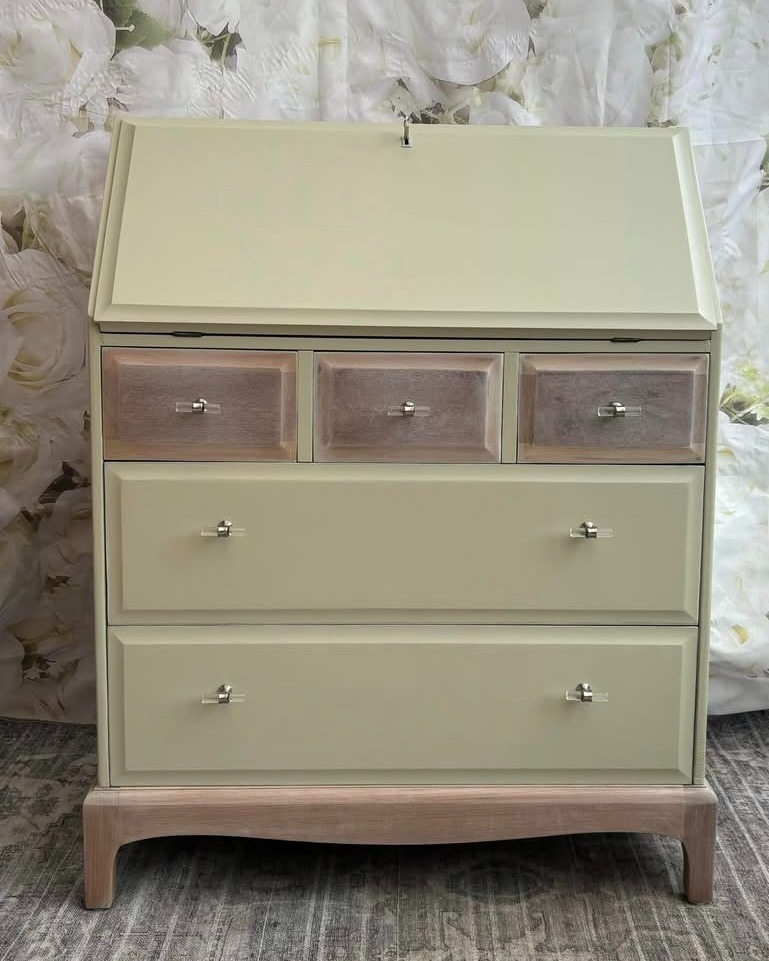
Tracey Bush paired Bedford with a light wood tone on this stunning Stag bureau, which really brings out the warmth hidden within the colour.
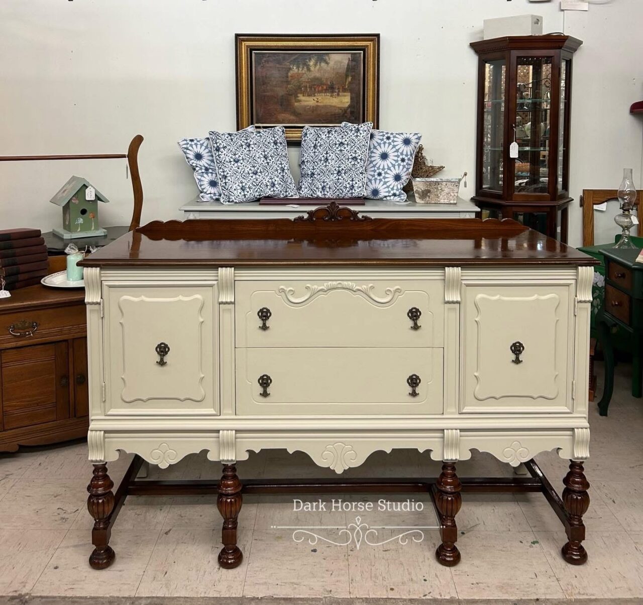
Dark Horse Studio created a gorgeous buffet in Bedford that feels timeless and elegant without trying too hard against the glorious dark wood that was refreshed with Hemp OIl.
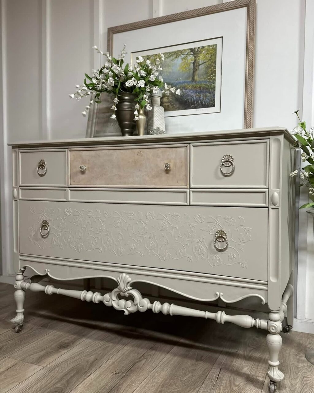
And Diane Owls actually added a touch of Cranberry into Bedford itself on this buffet to gently warm the colour up even further, showing just how versatile and adaptable this shade can be.
It’s one of those colours that never quite looks flat. There’s always something going on with it. And if you’ve ever painted with Bedford, you’ll probably know exactly what we mean because photographs never seem to capture the exact same shade twice!
So… what do you see when you look at this colour? More green, more gold, or somewhere perfectly in between?
